What it is
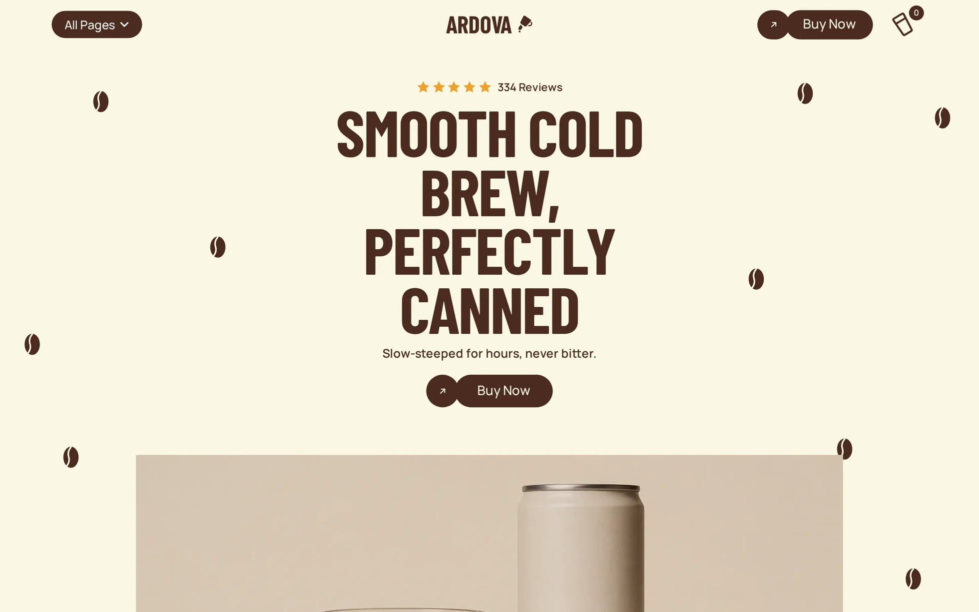
A cold brew brand's shop front, complete: a hero with a can and a glass, a press strip, an intro with three tilted prints, a six-product line-up, a review carousel over a photograph, a product argument, a founding story, a sliding photo band, a footer. One page, one HTML file.
The design follows that of a commercial template, of which nothing visual has been kept: the 23 photographs were regenerated for this template and the 26 icons redrawn as SVG in the page. All the code has been rewritten: the original came to 193 kB of minified CSS, jQuery, four Webflow bundles totalling 1.6 MB, GSAP with ScrollTrigger, SplitText and CustomEase, and an e-commerce basket that calls a non-existent API as soon as you leave the tool. Unreadable, and therefore useless for learning from.
That's the whole point: this template isn't here to be admired, it's here to be read, broken and rebuilt.
What you change first
The colours — eight lines
Right at the top of assets/css/style.css:
--cream:      #fbf7e4;  /* page background */
--brown:      #4a2b1e;  /* text, buttons, dark sections */
--brown-deep: #351d13;  /* the same brown, a notch darker (hover) */
--brown-soft: #7a5646;  /* the same brown, lightened for secondary text */
--card:       #f5eddf;  /* product card background */
--star:       #eda12a;  /* stars and the “Verified” badge */
One thing to grasp before touching anything else: there are three browns, not one. The plain brown clears contrast on the cream at 11.8:1, the dark one is for hover, the light one for secondary text. Change one and you have to re-check the other two — an accent that passes on a flat background can vanish into a photograph.
The name
Search for “Ardova” in index.html. No CSS class carries the brand name: a find-and-replace can't break anything.
The sizes
The type scale is declared once, then redeclared at every breakpoint — 991, 767 and 479 px. So a heading never gets its own media query: you change --h2 and every h2 on the page follows.
The thirteen effects, and how they're built
The original doesn't use Webflow's animation engine but GSAP, driven by four scripts sitting in clear text in the page. The settings below come straight out of them — durations, curves, offsets, thresholds — completed by what wasn't in there and had to be measured in the browser: the speed of the two sliding bands. 32 elements carry a reveal in the original export.
| Effect | Where | How |
|---|---|---|
| Words rising | 10 headings | split into <span> by the JS, each word 80 ms after the one before, back.out(2) |
| Scroll reveal | 14 blocks | IntersectionObserver, firing 15% up from the bottom of the screen |
| Pop-in | the coffee beans | scale 0.6 → 1 with the page load |
| Fast rise | hero shot | 60 px in 300 ms, 700 ms after the rest |
| Three prints bouncing in | intro | scale 0 → 1, 200 ms apart, overshoot on arrival |
| Floating cans | 6 product cards | 41 px up and back, 2 s, forever — on the wrapper, so the tilt stays free |
| Can straightening | card hover | 7° → 0° in 350 ms on the image inside |
| Three-part button | 8 buttons | the front dot shrinks away, the pill slides left and tilts, a second dot pops out on the right — three transitions, three delays |
| Print hop | 3 photos | up 34 px, back to 18, settling at 22 — the recoil of the original, in keyframes |
| Press logos | 4 cells | three logos, a stop on each, 6.3 s round trip (measured) |
| Photo band | bottom of the page | 39.8 px/s (measured), two identical panels, a seamless loop |
| Review carousel | 6 reviews | native scroll-snap: dragging, swiping and the keyboard all work without JS |
| Dropdown menu | header | aria-expanded, closes on Escape and on an outside click |
What you should know
- No external requests. Checked at three widths: every request is local. The original loaded jQuery, four bundles and GSAP from three domains.
- Scroll reveals can't hide the content. The hidden state only exists once the JavaScript has run. Checked by turning scripting off: 13 headings out of 13 stay visible, 0 blocks hidden, and the menu is open. The original set its initial state from JavaScript, with a fallback in case GSAP never arrived.
- Zero inline styles, zero inline scripts. Served under the site's strict security policy, with no violation. Even the tilt of the prints and the position of each bean are classes.
- The trigger sits 15% up from the bottom of the screen, and it is measured on the screen, not on the element: a threshold given as a fraction of the element would leave anything taller than the window invisible for good.
-
Accessibility: skip link, menu state announced, carousel position announced in a
role="status", decorations hidden from screen readers, visible focus, animations switched off — delays included — if the system asks. - Responsive checked at 390, 1440 and 2560 px, on load and after scrolling all the way down, with no horizontal overflow.
What isn't perfect
Better said here than left for you to find out.
- The heading font isn't the original's. That one ships as “All rights reserved”, so it can't be redistributed. Barlow Condensed was picked by measurement: its line runs 7.9% wider at the same size, against −8.8% to +22.6% for the five other condensed faces tested. Some heading blocks are therefore a little wider here — same number of lines, slightly more room.
- The background video is now a still. 1.42 MB of MP4 and 1.53 MB of WebM for decorative coffee dust; the regenerated still does the same job for about a twentieth of the weight. The pause button that came with it is gone.
- The page is 2.0% shorter than the reference at 1440 px, 1.3% at 479 px. Section by section the gap runs from 0% to −3.5% on a wide screen; on a narrow one two sections rearrange their blocks differently and sit further out, the footer at −17%. Nothing overlaps.
- The “hand and can” shot covers its own heading. On the original it was cut out and the heading showed through; a generated photograph comes with its background. The heading now sits above it.
- The e-commerce basket has been removed. Outside its original tool it called a non-existent API. The icon and its zero counter are there for the drawing and point at the line-up.
- The original has eight pages, this template has one. Menu and footer links have been brought back to real anchors, and the entries with no equivalent are replaced by a contact column.
Download it. Open it. Make it yours.
Ardova is free to download, with the complete source and every local asset included.
Complete source · No account · No framework