What it is
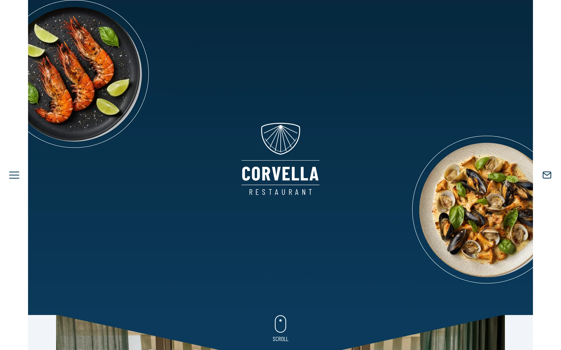
A one-page marketing site for a seaside restaurant: a hero screen with the logo centred between two cut-out plates, a full-width photograph with a chevron cut into it, three rotating dishes, a wine banner, a carousel of three photos, a single sentence on blue, a booking form and a four-column footer. One page, one HTML file.
What makes this site is the blue and what gets cut into it. The large photos aren't laid edge to edge: a triangle of the background colour bites into their top or bottom edge, and it's a single line of clip-path that draws it — not an image, not a mask. The second gesture is the
magnifier in the blue section: a 200 px disc following the cursor while the photograph it reveals stays put.
The design comes from a Webflow restaurant template of which only the structure has been kept. Everything else has been rewritten: jQuery, the 1.17 MB bundle holding the IX2 animation engine, the 70 kB of minified CSS, the home-made slider, a Lottie animation, the editor's badge, the Google Maps widget, and the style="opacity:0" set inline on every animated block — which a strict security policy blocks, leaving a blank page.
The site has been renamed, and nothing of the original is left in the files: name, logo, address, phone number, email, social account, dish names. The eight photographs were generated for this template and the six drawings — the logo's shell, the fish, the net, the nautilus, the scatter of shells, the neighbourhood map — are written by hand in SVG.
What you change first
The colours — five lines
Right at the top of assets/css/style.css:
--blue:       #0b3a5b;  /* blue backgrounds, text on the cream */
--blue-dark:  #06283e;  /* the same blue, one notch darker (hover) */
--blue-light: #6e9dbb;  /* the same blue, lightened: drawings laid ON the blue */
--cream:      #f1f5f7;  /* page background */
--white:      #ffffff;  /* cards and rails */
One thing to know before touching it:
there are three blues, and they aren't interchangeable. The solid one holds at 10.8:1 on the cream and carries white at 11.9:1; the dark one is there for hovers (13.9:1 on the cream); the lightened one is for the nautilus, the shells and the rules laid over the blue, where the solid one would disappear (4.1:1). Changing one means changing all three — and the drawings' colour is written in the stroke attribute of the SVG files, not in the CSS.
The name
Search for “Corvella” in index.html: the title, the description, the logo repeated three times, the email address, the social account, the footer. No CSS class carries the brand name, so a find-and-replace can't break anything. The logo isn't an image: it's a paragraph with a shell in SVG and two lines of text, sized by a single variable, --mark.
The dishes
A dish is one <a class="dish">: a cut-out plate in a circle, a label beneath. Duplicate it or delete it, the grid recomposes itself. The plates are WebP files with a transparent background — if you replace the photo, cut it into a disc, otherwise the file's white corner will show against the blue.
The sizes
The type scale is declared once at the top, then redeclared at each of the four breakpoints. So a heading never gets its own media query: you change --size-h2 and every heading follows. The layout too fits into four variables, all in viewport units: --gutter, --inset,
--rail and --plate.
The eleven effects, and how they're built
The settings aren't eyeballed: they're read out of the store
ixData of Webflow's animation engine, then filtered down to the home page and deduplicated. The template declares
31 events there for 12 distinct effects. Eleven are reproduced; the twelfth animated the template author's business card, removed along with it.
| Effect | Original | Here |
|---|---|---|
| Loading screen | logo y 100% → 0 and blur 10 → 0 px in 700 ms, scrim raised by −100 vh in 1 s (700 ms delay), page fading in over 500 ms | three @keyframes chained by their delays, behind the class js |
| Hero entrance | plates x −40% and +50% → 0 (1 s and 1.4 s), rotation 180° → 0, logo scale 0.5 → 1, 2.5 s delay | same durations, delay brought down to 1.5 s |
| Reveal from below (5 blocks) | opacity + y 100 px, 1 s, outQuart, 0% threshold | [data-reveal] + IntersectionObserver, threshold moved to 15% |
| Photo parallax | y −20% → +20% and scale 1.1 → 1 over the scroll | the script writes --p (0 → 1), le transform is worked out in CSS |
| Drawing parallax | fish y −60% → +30%, net 0% → +20% | same --p, two amplitudes |
| Magnifier following the pointer | mask moved by ±50 vw and ±50 vh, photo moved by as much the other way | --x / --y on the block, the photo carries the opposite translation |
| Plate hover (3 dishes) | rotation 0 → 90° in 2 s, disc scale 1 → 1.1 in 500 ms; return 300 ms | two CSS transitions, same durations |
| Arrow link hover (3 links) | label skewX −10° and x +5 px, arrow x +5 px, 300 ms; return 200 ms | CSS transitions, same durations |
| Full-screen menu | panel x −100% → 0 in 400 ms, links fading in over 400 ms; closing 400 ms | <details> native + @keyframes, replayed by the script |
| Carousel | home-made slider, 500 ms, endless loop, auto-play disabled | track scroll-snap, two arrows, three anchors, position announced |
| The “Scroll” wheel | a 98-frame Lottie animation at 60 fps | a drawn SVG + one @keyframes of 1.6 s |
What you should know
- No external requests. 21 requests on load, all of them local. Self-hosted fonts, local images, zero CDN. Checked by listing the requests on load, not assumed. The original pulled jQuery, a Webflow bundle and Google Fonts from four domains.
-
Without JavaScript, nothing is hidden. The hidden state of the scroll reveal is written under
html.js, a class set before the first paint. Checked by removing the<script>: 9 headings out of 9 visible, no block hidden, the loading screen doesn't appear and the menu still opens. -
The loading screen doesn't depend on the script to leave.
Each step is a CSS animation with a delay, not a class added by the JavaScript. If
main.jsfails afterenhance.jshas set the class, the page still finishes appearing — which is exactly the case a full-screen scrim makes dangerous. -
The menu is a
<details>. It opens by click and by keyboard, script or no script, and<summary>exposes the expanded state on its own. The script only adds the entrance animation — and it has to add it, because a closed<details>is hidden bycontent-visibilityand a@keyframeswould never replay after the first opening. -
The carousel slides on its own. The track is a scroll container with
scroll-snap: mouse, finger and arrow keys all work without a line of JavaScript, and the three dots are real anchors. The two arrows and the position announced throughrole="status"are the layer on top. Measured at all three widths: the last photo is reachable. - Zero inline styles, zero inline scripts. The template honours the site's strict security policy, checked by serving the folder with the real header: zero violations, zero JavaScript errors.
- The trigger sits 15% up from the bottom of the screen, measured against the screen and not against the element as in the original. A threshold expressed as a fraction of the element never fires for a block taller than the viewport — and here a block visibly enters instead of having finished before it was seen.
-
The menu links are in outlined text.
-webkit-text-strokedoesn't exist everywhere; where it's missing the links would be invisible, so an@supports notfills them in white. - Responsive checked at 390, 1440 and 2560 px, on load and throughout the scroll, with no horizontal overflow.
What isn't perfect
Better said here than left for you to find out.
- The bottle's label is blank. The original showed a real wine brand. Writing “Corvella” on it would have meant recomposing the photo; a cream label with no text is more honest and commits nobody.
-
The map is a drawing, not a map. The original embedded a Google Maps widget: outside its host it loads nothing, and it would make an external request.
map.svgis a neighbourhood plan drawn by hand; the marker moves by changing onetransform. -
The booking form has no server. It validates, then shows a confirmation and repeats the phone number. Four lines to delete in
main.jsand oneactionto fill in to wire it up. -
The layout is in viewport units
(
vw), as in the original — that's what makes it hold at every width without a media query. Butvwincludes the scrollbar: on a browser that reserves it, expect about fifteen pixels of difference from the measurements quoted. - The magnifier drifts on its own on a touchscreen. With no pointer to follow it would sit in the centre for the whole visit; a 22 s animation walks it around instead.
- The links point to anchors on this page. The original is a multi-page site; here everything leads back to an existing section rather than to a 404.
-
The images are royalty-free: the eight photographs and the six drawings were produced for this template and can be redistributed without restriction and without attribution. Only the fonts keep their own licence — Barlow and Barlow Condensed are under the SIL Open Font Licence 1.1, whose text ships in
fonts/OFL.txt.
It’s waiting for you in the library.
Corvella comes with the subscription, alongside the rest of the library and the full course.
Immediate access · No commitment · Cancel in one click