What it is
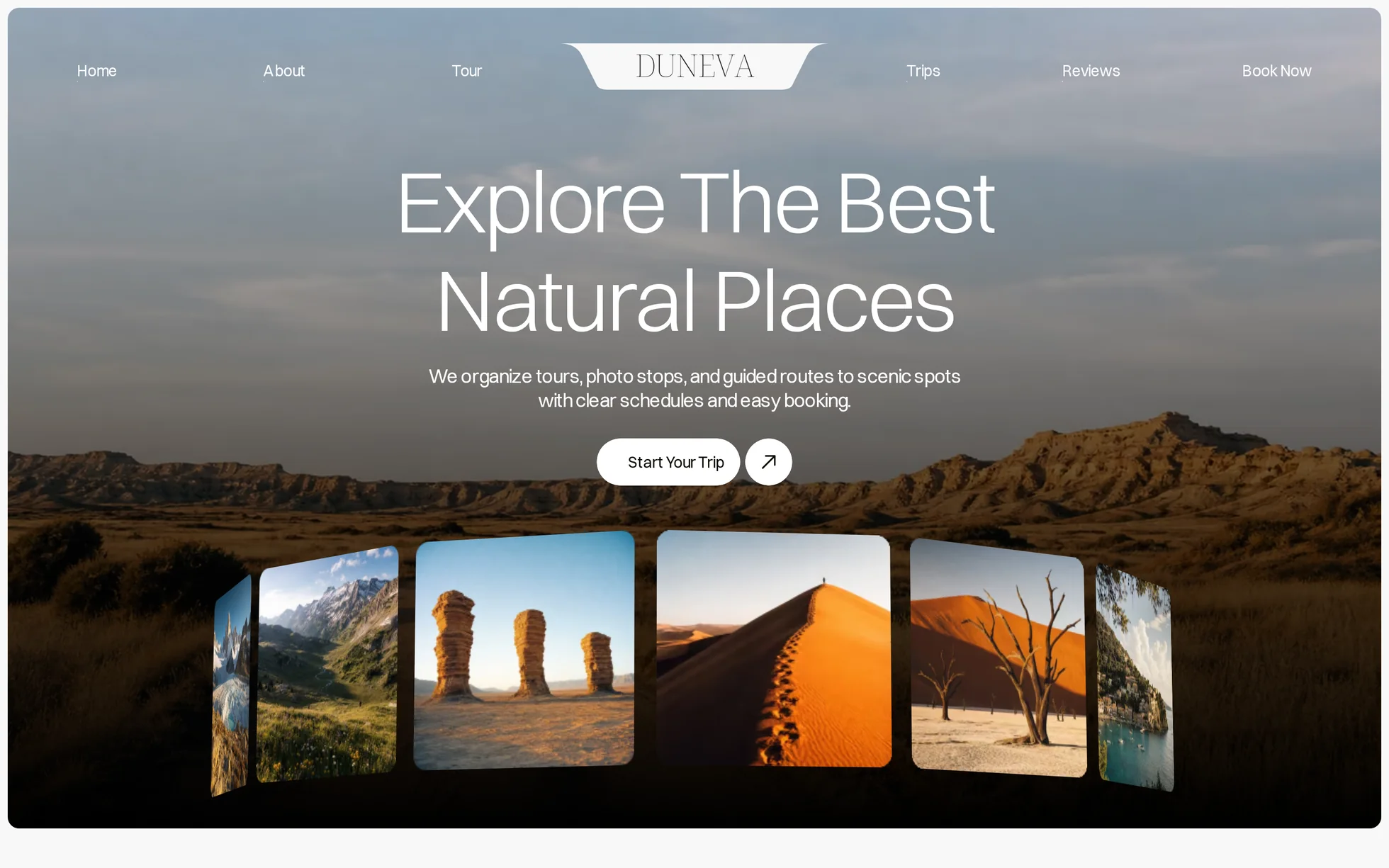
A travel agency site, complete: a photo hero with its ring of thumbnails, an intro, six tours in a zigzag, four getaways, a film block, reviews in a carousel, an FAQ and a footer. One page, one HTML file.
The design follows that of a Webflow template, of which only the photos have been kept. All the code has been rewritten: the original came to 112 kB of minified CSS, jQuery, two Webflow bundles totalling 237 kB, a proprietary animation engine (IX3) and four GSAP files loaded from two domains.
That's the whole point: this template isn't here to be admired, it's here to be read, broken and rebuilt.
What you change first
The colours — eight lines
Right at the top of assets/css/style.css:
--color-ink:      #0f0a01;  /* text on a light background */
--color-paper:    #f8f8f8;  /* the page background */
--color-surface:  #ffffff;  /* the cards, the film section */
--color-deep:     #08070c;  /* the two dark sections */
--color-gold:     #febd1a;  /* the stars and the form's arrow */
--color-star:     #fa9200;  /* the review stars */
--color-star-off: #d9d9d9;  /* the fifth star, switched off */
--on-dark-soft:   rgba(255,255,255,.7);  /* secondary text on black */
One thing to grasp before touching anything else: the gold falls to 1.7:1 on white. So it never carries text here, only stars and an 18 px arrow, on black — where it climbs back to 12.0:1. If you replace it with a colour that has to carry text, you'll need three shades of it: the solid one, a darkened one for hovers, a lightened one for photos. Changing one means changing all three. The rest of the palette is generous: 18.6:1 for the ink on the paper, 5.2:1 for secondary text, 20.1:1 for white on black.
The name
Search for “Duneva” in index.html. No CSS class carries the brand name: a find-and-replace can't break anything. That leaves two images to replace, the navigation bar's logo (assets/img/logo-wordmark.webp) and the giant lettering in the footer (assets/img/footer-wordmark.svg).
The sizes
The type scale is declared once, then redeclared at each breakpoint (991, 767 and 479 px). So a heading never gets its own media query: you change --display-xl-size and the whole page follows.
The eighteen effects, and how they're built
All taken from the data of the original's animation engine — 36 interactions and 36 timelines pulled out of its store, with their durations, their offsets and their curves, including the two bespoke ones. Whatever wasn't in the data was measured in the browser, not by eye.
| Effect | Original settings | How |
|---|---|---|
| Ring of 14 photos | CSS from the export: rotateY(i × 360/14) translateZ(480px), 2500 px perspective, one turn in 50 s, plane tilted by 6° | taken as it is: it's CSS, not editor code. A gradient mask fades out both edges |
| Home entrance | on load: heading split into lines, +25 px, 0.1 s stagger, 0.7 s power3.out; text and button +40 px; the ring rises 50 px from 0.8× | same values, played after the first paint; the line splitting is redone in 40 lines of JavaScript |
| Section headings (5) | on scroll, top 90%: lines, +25 px, 0.16 s stagger, 0.8 s, bespoke curve M0,160 C40,0 80,0 160,0 | the same — the curve translates into cubic-bezier(.25, 1, .5, 1). Threshold moved to 15% up from the bottom of the screen |
| “(About Us)” labels (6) | top 90%: +18 px, opacity, power3.out | same |
| Block reveals (24) | top 90%: +40 px over 0.7 s power2.out, or +50 px with a 0.12 s stagger | IntersectionObserver, same values and same staggers |
| Card cascade | delay per column following 1 − 0,5ⁿ multiplied by 0.5 s, reset on every row | same curve, worked out in JavaScript — the original works it out in CSS with sibling-index(), which few browsers know |
| Curtain over the two photos | scrub 0.8 from top 90% to top 30% (and 24%): clip-path: inset(100% → 0) | same clip-path; the progress is written into a variable on scroll, then smoothed over ~0.8 s |
| Film frame | scrub 0.8 from top 80% to top 20%: inset(25% → 0) | the same, same mechanism |
| Gooey button (4) | CSS from the export: an SVG filter, feGaussianBlur + feColorMatrix, the circle slides 8 px in 0.5 s cubic-bezier(.34, 1.56, .64, 1) | taken as it is — the filter is defined once at the end of the page |
| Arrow links (8) | hover: the arrow leaves at x +100%, y −20 px, 0.3 s | fixed: two arrows in an 18 px window, a full diagonal (see “What isn't perfect”) |
| Round buttons (4) | hover: x 0 → 100%, y 0 → −100%, power2.out | same |
| Menu underline (6) | hover: xPercent −100 → 0 in 0.3 s, linear | same |
| FAQ accordion (6) | click: height 0 ↔ auto, the vertical stroke of the “+” turns from 90° to 0, power2.inOut | <details> native; the height is animated by the script, because a closed <details> is removed from rendering and no keyframe replays inside it |
| Review carousel (5) | Webflow slider, two arrows | scroll-snap native: it slides, swipes and can be reached from the keyboard without JavaScript. The arrows only do a scrollBy, and the position is announced |
| Footer photos | top 90%: opacity 0.5% → 100%, rotation 0 → −14° and 18°, 0.7 s | same |
| Giant footer lettering | top bottom: rises by 100%, opacity, 0.7 s power3.out | the same, but the observer watches the container: an element translated below the page never enters the screen |
| Mobile menu | click: the two strokes turn by ±45° and shift 7 px, 0.4 s expo.inOut | the same, plus closing on Escape and on clicking a link |
| Film lightbox | Webflow lightbox opening a Vimeo video | <dialog> native, and a local 226 kB video whose source is only set on click |
What you should know
- No external requests. 33 requests on load, all of them local. The original loaded jQuery, two Webflow bundles, four GSAP files and two fonts from two domains, plus a Vimeo player on click.
-
Scroll reveals can't hide the content.
The hidden state only exists once the JavaScript has run. Checked by switching the scripts off: all seven headings stay visible, both photos are uncovered, the film frame is open and all six accordions open. The original, meanwhile, set
visibility: hiddenon thirty-four selectors. - Zero inline styles, zero inline scripts. Checked by serving the folder with the site's strict security policy, not assumed: zero violations, zero JavaScript errors.
- The trigger sits 15% up from the bottom of the screen, not at the first pixel as in the original: a block visibly enters instead of having finished before it was seen. A safety net reveals whatever is left when you reach the bottom.
- The review carousel works without JavaScript. It's a real horizontal scroll container: you can swipe it and reach it from the keyboard. The buttons come on top.
-
The video only loads on click.
preload="none"and a source set by the script: a visitor who never plays the film doesn't download its 226 kB. - Accessibility: skip link, menu state announced, native FAQ, carousel position announced, a single visible focus style, decorations hidden from screen readers, animations and delays switched off if the system asks — the ring then stops on a frame rather than disappearing.
- Responsive checked at 390, 1440 and 2560 px, on load and after scrolling all the way down, with no horizontal overflow.
What isn't perfect
Better said here than left for you to find out.
- The font isn't the same. The original uses Saprona, whose file says “All rights reserved”: it can't be redistributed. Switzer replaces it — same family of grotesques, same apertures — but it's slightly narrower. The line breaks move, and that accounts for most of the differences that follow.
- The footer is 2% shorter at 767 px. The three columns of links fit on one row where the original takes two, because the labels are shorter and the font narrower. Nothing overlaps. At the other widths, the total difference is 0.1% at 1440 px, 0.3% at 991 px and 0.8% at 479 px.
- The film isn't the original's. The original opens a Vimeo video — an external request, and a licence that isn't ours. Ours is a 12 s pan built from the block's photo, local, 226 kB. Compared after re-encoding: WebM came down to 113 kB but mp4 plays everywhere, including on older Safari.
- The links' arrow has been fixed. In the original, the arrow's copy sits 100 px lower and only rises 20 px: the animation never closes. Here both arrows make the full diagonal in an 18 px window.
- The inner pages don't exist. The original is a multi-page site; all its links are brought back to anchors. Two menu entries with no matching section have been renamed — “Gallery” becomes “Trips”, “Blog” becomes “Reviews” — and the footer's “Utility Pages” group becomes “Explore”.
-
The form has no server. It opens the mail client with the address entered. A strict policy also forbids
form-action: mailto:: without JavaScript, the form falls back to the footer's anchor rather than posting into the void. - The photos are in AVIF. That was already the original's format, and WebP weighed 30 to 85% more at equal quality. Every browser released since 2023 reads it; an older browser won't show the images.
- The photos come from the original template and all look like generated images — their file names say so. The code is yours; for the visuals, check the licence or replace them. The font is under the ITF Free Font Licence and is redistributable.
It’s waiting for you in the library.
Duneva comes with the subscription, alongside the rest of the library and the full course.
Immediate access · No commitment · Cancel in one click