0 external requests, 0 dependencies, 0 build steps
12 animations lifted from the reference's animation engine
−0.1% total height against the reference site
What it is
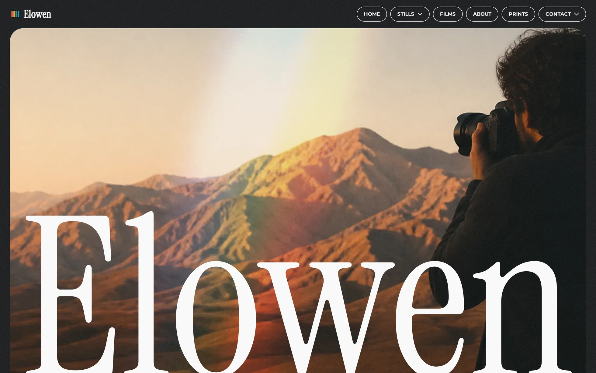
A photographer's portfolio, complete: a full-height opening window with a loading choreography, a sticky introduction the portrait scrolls past, three photo series whose prints fan out as you scroll, one film in a frame that tilts towards your cursor, and a giant e-mail address crossed by prisms. One page, one HTML file.
The design follows that of a commercial template. Nothing of its media has been kept: the twelve photographs were regenerated, the background video was replaced by a CSS gradient, and the two prism images of the contact section are now a masked gradient. All the code was rewritten — the original shipped 120 kB of minified CSS, 1.4 MB of bundles, a proprietary animation engine and an e-commerce basket that calls a non-existent API as soon as you leave the tool.
That's the whole point: this template isn't here to be admired, it's here to be read, broken and rebuilt.
What you change first
The name — three places
The wordmark is text, not an exported SVG: the brand of the navigation bar, the <h1> of the opening window and the <title>. If your studio name is longer or shorter than “Elowen”, nudge --wordmark (37.3 vw for six letters) until the word fills its box. No CSS class carries the brand name.
The spectrum — one gradient
Right at the top of assets/css/style.css:
--spectrum: linear-gradient(270deg,
  #2b3fa8, #2f8fd0 19%, #17936f 44%, #f4b53c 67%, #e2453c 89%);
One thing to grasp before touching anything else: the site has no flat accent colour. Its signature is this prism, and it is used three times — smeared to 50 px of blur behind the series titles, tilted across the opening window in colour-dodge, and masked into two rings in the contact section. Change it once, and all three change together.
The sizes
Six steps, --h1 to --h6, declared once then redeclared at 991, 767 and 479 px. A heading never gets its own media query: change --h3 and every section title on the page follows.
The twelve effects, and how they're built
All taken from the data of the original's animation engine — 150 events on this page, pulled out of the store then deduplicated down to 69 distinct animations, of which 18 actually apply to this page. Grouped here into twelve effects, with the original's own durations, curves and delays.
| Effect | Where | How |
|---|---|---|
| Loading choreography | opening window | five photos rise 60 vh, straighten over 500 ms, then the middle one scales ×12 over 1300 ms |
| Text rising into view | everywhere | +100%, 16° tilt and 10 px of blur → 0, fired 15% up from the bottom of the screen |
| Portrait parallax | introduction | −10% → 13% inside a frame 20% taller than itself, smoothing 80 |
| Prints fanning out | 3 series | two cards travelling on four channels each, everything landing at 55% of the scroll |
| Frame tilting | film | rotateY ±5°, rotateX ∓5°, the photo sliding the other way; perspective on the parent, rotation on the child |
| E-mail arriving | contact | the address flies in from 100 vw, two prisms grow and turn 279°, a shadow copy slides out from behind |
| Button hover | everywhere | a white panel parked one height below slides up, the label turns black and blurs for a fifth of a second |
| Wordmark hover | navigation | a 3 px ripple out of focus and back |
| Dropdowns | navigation | hover and keyboard focus, in CSS alone, with a 200 ms closing delay to cross the gap |
| Full-screen menu | navigation | a checkbox, unrolled with clip-path |
| Light leak | opening window | a blurred spectrum in colour-dodge, drifting over 24 s |
| Film grain | whole page | an SVG turbulence tile inlined in the stylesheet, 0.4 kB |
What you should know
- No external requests. Everything is local: fonts, photographs, scripts. The original loaded five bundles from two domains.
-
Scroll reveals can't hide the content. The hidden state only exists once the JavaScript has run. Checked by removing the
<script>: 6 headings out of 6 stay visible, 0 blocks hidden, and the opening window is already assembled. The original, meanwhile, setstyle="opacity:0"on every animated block. -
Zero inline styles, zero inline scripts. The template honours the site's strict security policy — the very one that
style="opacity:0"breaks. - The trigger sits 15% up from the bottom of the screen, measured on the screen and not on the element: a threshold given as a share of the element would leave anything taller than the screen hidden forever.
- Accessibility: skip link, menu state announced, decorations hidden from screen readers, one visible focus ring, animations switched off if the system asks — delays included.
- Responsive checked at 390, 479, 767, 991, 1440 and 2560 px, on load and after scrolling all the way down, with no horizontal overflow.
What isn't perfect
Better said here than left for you to find out.
- The background video was not remade. The original serves a 4 MB clip of light through a prism, blended in colour-dodge. It is replaced by a CSS gradient with the same blend and a slow drift: the gesture is the same, the weight goes from 4 MB to nothing. It is a steadier light than real footage.
- The e-commerce basket has been removed. Outside its original tool it called a non-existent API. The “Prints” entry opens an order e-mail instead.
- The original has several pages — about, process, shop, three home variants, three contact variants. Everything is folded into anchors of the single page, and the navigation keeps two of the four dropdowns: the two with a real destination.
- The four small photos and the second card of each series disappear below 992 px, as in the original: on a narrow screen they would land on top of each other.
- The opening sequence runs for three seconds before the wordmark arrives. That is long, and it is the original's own timing.
- The wordmark is six letters where the original had ten. Measured side by side, the two baselines are five pixels apart and the word fills the same width — but the letters are necessarily taller, and “Elowen” has no descender to hang below the frame. Same cause for the introduction heading, which wraps onto one line fewer below 992 px.
-
The film has no player: the frame is a link. Wiring a
<video>or a dialog takes about twenty lines.
It’s waiting for you in the library.
Elowen comes with the subscription, alongside the rest of the library and the full course.
Immediate access · No commitment · Cancel in one click