What it is
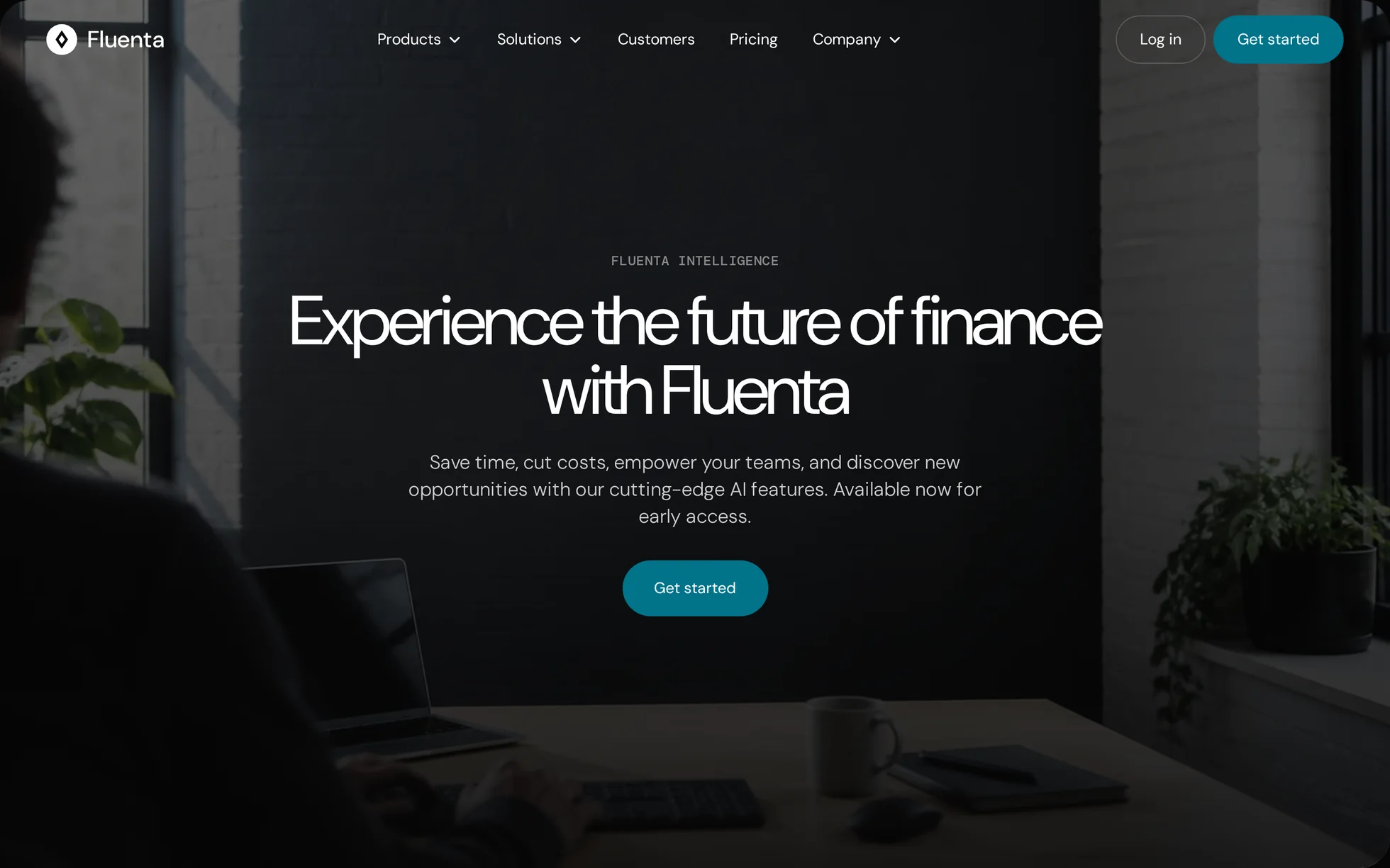
A complete site for a business finance platform: a full-screen hero that shrinks as you scroll past it, three product cards, an enlargeable dashboard, three customer stories, a newsroom, a scrolling wall of client logos, a call to action and a four-column footer. One page, one HTML file.
What makes this template is that the product screenshots are not
screenshots. The three product mock-ups and the invoice dashboard
— tabs, KPI tiles, a six-column table with its status pills — are written
in HTML and CSS. They stay sharp at any screen density, they translate,
and you can change a figure without opening an image editor. The dashboard
is sized in em, so the enlarged view scales the whole panel by
changing a single font-size.
The design comes from a Webflow template for a financial software vendor of
which not one image remains: the six photographs were
regenerated for this template, at the exact aspect ratio measured on the
original. Every line of code was rewritten: jQuery, the proprietary IX2
animation engine (239 events for 33 distinct effects), the minified CSS,
the remote font loader, and style="opacity:0" set inline on
every animated block — which a strict security policy blocks, leaving a
blank page.
That is the point: this template is not here to be admired, it is here to be read, broken and put back together.
What you change first
The colours — the accent is three shades
Right at the top of assets/css/style.css:
--bg:           #060606;  /* page background */
--bg-soft:      #14191f;  /* cards, the dashboard frame */
--brand:        #00738a;  /* solid fills, white text on top */
--brand-strong: #005c6e;  /* the same accent, one notch darker (hover) */
--brand-bright: #3fb8cf;  /* the same accent, lightened for text on dark */
--deep:         #00303f;  /* the working-capital card */
--forest:       #002204;  /* the smart-accounting card */
--ink-2:        #ffffffcc;  /* running text */
--rule:         #ffffff33;  /* hairlines */
One thing to understand before touching anything else: there are three accents, not one. The solid accent is a button background with white text on it (5.4:1). That same colour as text on the near-black page would drop to 3.7:1, unreadable: the lightened one takes over (8.7:1). Change the accent, change all three.
The name
Search for “Fluenta” in index.html: the logo, the title, the
headings and the footer. No CSS class contains the brand — a find-and-replace
cannot break anything. The logo is a three-shape SVG, repeated in
assets/img/favicon.svg.
The sizes
The type scale is declared once, then re-declared at each breakpoint (991
and 767 px). A heading therefore never carries its own media query: change
--h1-size and the whole page follows — 72 px on a large
screen, then 50 and 48 px on the way down. The values are the ones measured
on the original at 1440, 991, 767 and 479 px.
The nine effects, and how they’re built
They were not watched, they were read: a Webflow export keeps its whole
animation engine in a JavaScript store, reachable at
Webflow.require('ix2').store.getState().ixData. 239 events came
out of it — the tool creates one per collection item — which deduplicate
down to 33 distinct effects, half of them belonging to other pages of the
gabarit. Nine play on this one.
| Effect | Original settings | How |
|---|---|---|
| Headings rising (26 blocks) | opacity + y 16 px, 1000 ms, cubic-bezier(.23,1,.32,1) | [data-reveal] + IntersectionObserver |
| Visuals rising | same, y 32 px | same, one class apart |
| Hero shrinking | scale 1 at 40 % of the track, 0.9 at 60 % | sticky panel over a 200 vh track; the scroll position writes --hero-scale |
| Buttons lifting | y 0 → −4 px, 250 ms | same, under @media (hover: hover) |
| Cards growing | scale 1 → 1.02, 250 ms | same |
| Logo wall | x 0 → −100 %, 40 000 ms, linear | list written twice, translateX(-50%) over 40 s |
| Dropdown menus | 500 ms / 250 ms | pure CSS :hover + :focus-within, two delays: 80 ms opening, 220 ms closing |
| Mobile sheet | 500 ms | grid row 0fr → 1fr, 320 ms — animates to its own height |
| Story thumbnails | absent from the original | added: scale(1.04) over 400 ms, so those three cards answer like the others |
What you should know
No external request, no build step. Open
index.html in a browser and it works. Self-hosted fonts, local
photographs, no CDN, no tracker.
Without JavaScript, nothing is hidden. The hidden state of
the reveals is written .js [data-reveal], and
enhance.js is the only thing that sets that class. Checked with
JavaScript off: 9 headings out of 9 stay visible, 26 animated blocks out of
26 too, and the dropdown menus still open — they are CSS.
The reveal threshold is 15 % from the bottom of the screen, not 20 % of the element as in the original. The margin is measured on the viewport, not on the element — otherwise the hero, taller than the screen, would stay hidden for ever. A safety net reveals whatever is left when the bottom of the page is reached.
The hero sticks, it does not scroll. A 200 vh track holds a
100 vh panel pinned to its top: the page scrolls one whole screen “through”
a still hero before handing over. Which is why the root uses
overflow-x: clip and not hidden — the latter would
turn the root into a scroll container and unstick the panel.
Under a strict security policy
(script-src 'self'; style-src 'self'): zero violations, checked
by serving the folder with the real header. No inline style, no inline
script, no onclick.
No horizontal overflow at 390, 1440 and 2560 px, on load and
after a full scroll. Accessibility: skip link, aria-expanded kept
truthful on the three menus and the mobile button, a native
<dialog> for the enlarged dashboard, a single visible focus
ring, and prefers-reduced-motion that zeroes the delays as well.
What isn’t perfect
The two background videos are gone. They weighed 6.4 MB between them for a fixed backdrop, and showed a person with a recognisable face. A generated photograph at the same framing replaced them — 53 kB. The motion is genuinely lost; the weight-to-benefit did not justify it.
The “Demo” section no longer shows a video. The original
opened a lightbox onto a product tour; with no video to put in it, the
heading would have been a lie. The block became “Take a closer look at the
dashboard” and the button enlarges the mock-up in a
<dialog>. The structure is kept.
The original was a multi-page site — products, pricing, about, newsroom, contact. Everything is folded into anchors on the single page rather than left pointing at 404s. Two menu entries have no section of their own — “Pricing” and “About us” — and point at the nearest one.
The page is 7,252 px tall against 7,288 px for the reference (−0.5 %) at 1440 px, and 10,154 px against 9,811 px at 390 px (+3.5 %), both measured in a window of the same height — the hero is 200 vh, so a shorter viewport takes twice as much off it. Section by section at 1440 px, four of the eight land within a pixel and none is off by more than 3.2 %. The widest remaining gap is the product section at 991 px (−13.9 %), where the reference stacks fixed-ratio images. Nothing overlaps.
On mobile the dashboard does not shrink below 600 px: it scrolls sideways inside its frame. A six-column table squeezed into 350 px is no longer a table.
The avatars are monograms, not portraits. A generated image must not carry the recognisable face of a real person, and two letters in a coloured square do the same job for nothing.
The sign-up form posts nowhere. It checks the address and says so plainly. Wire it to your own service.
It’s waiting for you in the library.
Fluenta comes with the subscription, alongside the rest of the library and the full course.
Immediate access · No commitment · Cancel in one click