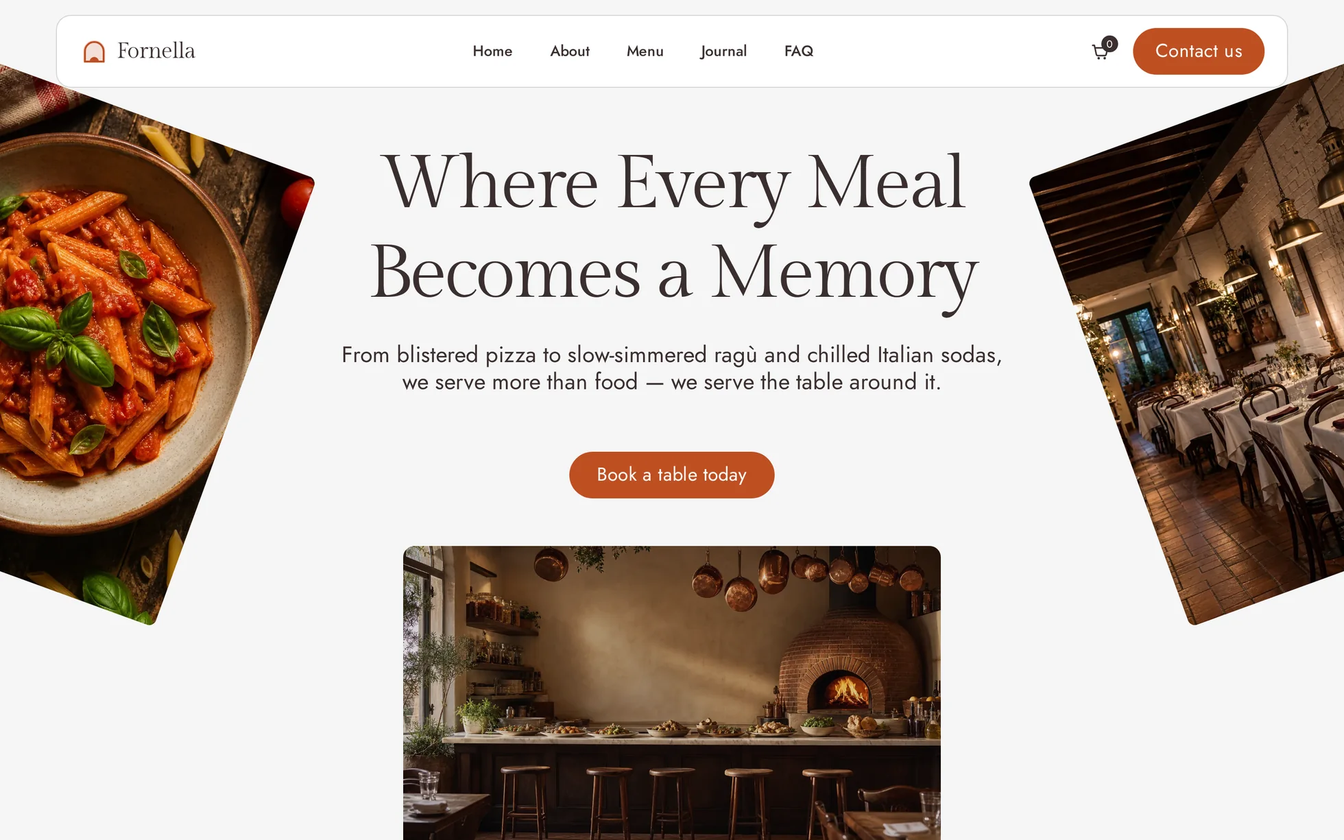
What it is
A complete site for a restaurant: a hero that opens as you scroll into it, four dishes that fly in from the corners and settle into a grid, a sliding word ticker, four food categories, a menu, three reviews, an FAQ, three journal cards and an Instagram strip. One page, one HTML file, 811 lines.
What makes this template is that five of its nine sections are
scroll scenes: a tall track holding a stage pinned to the top of
the screen, where everything that moves is driven by one number —
--p, the progress through the track, from 0 to 1. JavaScript
writes that number and stops there; the CSS does the rest. No animation
library, no scroll library, no animation-timeline either —
that one only exists in Chrome. 394 lines of JavaScript for the lot, and
the page still reads without them.
The design comes from a Webflow template for a restaurant of which
not one image remains: the photographs were regenerated
for this template. Every line of code was rewritten — jQuery, the
proprietary IX2 animation engine and its keyframe store, the minified CSS,
and the inline style="opacity:0" set on every animated block,
which a strict security policy blocks, leaving a blank page.
That is the point: this template is not here to be admired, it is here to be read, broken and put back together.
What you change first
The colours — the accent is three shades
Right at the top of assets/css/style.css:
--ink:        #3b2f2f;  /* headings, strong text */
--paper-off:  #f5f5f5;  /* the page's real background */
--paper-warm: #f4e1d2;  /* cream blocks */
--night:      #1c1c1c;  /* the dark half of the page */
--ember:      #bf4f22;  /* the accent, 4.82:1 on white */
--ember-deep: #93331f;  /* the same, darker — hover, small text on cream */
--ember-glow: #ea9b6e;  /* the same, lightened — the only one legible on a photo */
One thing to understand before touching anything else: there are
three embers, not one. --ember passes AA on white
(4.82:1) but disappears on a night-dark panel; --ember-glow
takes over there (5.76:1 on --ink). Change one and you must
change all three, or something goes illegible somewhere you are not
looking.
The name
Search for “Fornella” in index.html: the masthead, the title,
the reviews, the footer. No CSS class contains the brand — a
find-and-replace cannot break anything. The logo is a four-path SVG in the
masthead: an oven arch over a bed of embers.
The sizes
The type scale is declared once at the top, then re-declared at each
breakpoint (991, 767 and 479 px). A heading therefore never carries its own
media query: change --h1 and the whole page follows — 80 px on
a large screen, 40 px on a phone. The values are the ones measured on the
original at each width.
The five scenes, and how they’re built
They were not watched, they were read: a Webflow export keeps its whole
animation engine in a JavaScript store, reachable at
Webflow.require('ix2').store.getState().ixData. Out of it come
the exact keyframes — percentages, pixels, degrees, colours — for every
block that moves. Each scene below is a section 2,500 px tall holding a
stage of one screen; the numbers in the middle column are the original’s.
| Scene | Original keyframes | How |
|---|---|---|
| Hero | the two side photos go to x ±50 at 40 %, then x ∓20 / y +200 and scale 0.6 at 60 %, rotating 20° → 10°; the centre frame grows from 40 %×35 % to full; the type turns from brown to white between 50 % and 60 %; the ground goes black at 65 % | --p drives every one of them, keyframe lists interpolated in eight lines of JavaScript |
| Craft | four dishes wait at x ±130 / y ±100, appear at 45 %, land at 50–55 %; the middle block scales 0.5 → 1 between 50 % and 65 %; a circle of copy rises from y +100 to −1000 | same mechanism, one custom property per dish |
| Reviews | the word grows, holds, then leaves the frame while three cards stack up from below, each straightening as it arrives | same, plus a rotation that returns to zero |
| FAQ | the word FAQ drifts up behind the content; two thumbnails fly in from off-screen and settle beside the heading | same; the questions themselves are native <details> |
| Social | five photos rise into a row, then the whole strip slides sideways for the rest of the track | the strip slides by a share of its own overflow, so it always stops with the last tile at the right edge — never in empty space |
| Ticker | two rows of words sliding in opposite directions, looping | the list is written twice; the animation translates by exactly half the strip, so the loop has no seam |
| Categories | hovering a row lifts a small photo into view | CSS hover; the photo is aria-hidden — it decorates, it never carries information the text does not already give |
What you should know
No external request, no build step. Open
index.html in a browser and it works. Self-hosted fonts, local
photographs, no CDN, no tracker.
Delete the JavaScript and you get the same content, static.
Every hidden state is written under html.js, and
enhance.js — twelve lines — is the only thing that sets that
class. With scripts off, the scenes are simply nine sections one after the
other, the menu opens, the FAQ opens, and the Instagram strip is still
swipeable.
The menu and the FAQ are native <details>.
They open with a click, with the keyboard and with the browser’s own
find-on-page, which can reach inside a closed one. JavaScript only animates
the height.
Below 767 px the scenes stop being scenes. Pinning a stage and scrolling 2,500 px through it costs a phone user five screens of thumb-work per section: at that width the tracks collapse and every part is already at its end state. The script checks the media query and does not even measure.
Under a strict security policy
(script-src 'self'; style-src 'self'): no inline style, no
inline script, no onclick. The folder ships with a copy of the
site’s real headers so the local bench can serve the page under them.
Accessibility: a skip link, aria-expanded kept
truthful on the menu, decorative photographs in aria-hidden,
the order count doubled by a visually hidden sentence, and
prefers-reduced-motion honoured — the scenes are then read at
their end state instead of being driven.
What isn’t perfect
The basket is a decoration. The original is an e-commerce template: a real cart, a checkout, an order state. Here the icon carries a zero and points at the menu. A cart that pretends to work is worse than no cart — wire it to your own back end, or take the icon out.
The original was a multi-page site. Everything is folded into anchors on the single page rather than left pointing at 404s.
One number is not a timeline. Driving a scene with
--p is simple to read and cheap to run, but it ties every
part of a scene to the same progress. Two elements that should move on
different schedules need two keyframe lists, not two timelines — which is
exactly how the original does it too, and why its store is readable at
all.
The accent has moved. The original’s signature red is the one colour that cannot be reused as-is; it walked six degrees round the wheel and down in lightness, into fired-clay territory. Side by side, the page is a shade warmer than its reference.
It’s waiting for you in the library.
Fornella comes with the subscription, alongside the rest of the library and the full course.
Immediate access · No commitment · Cancel in one click