What it is
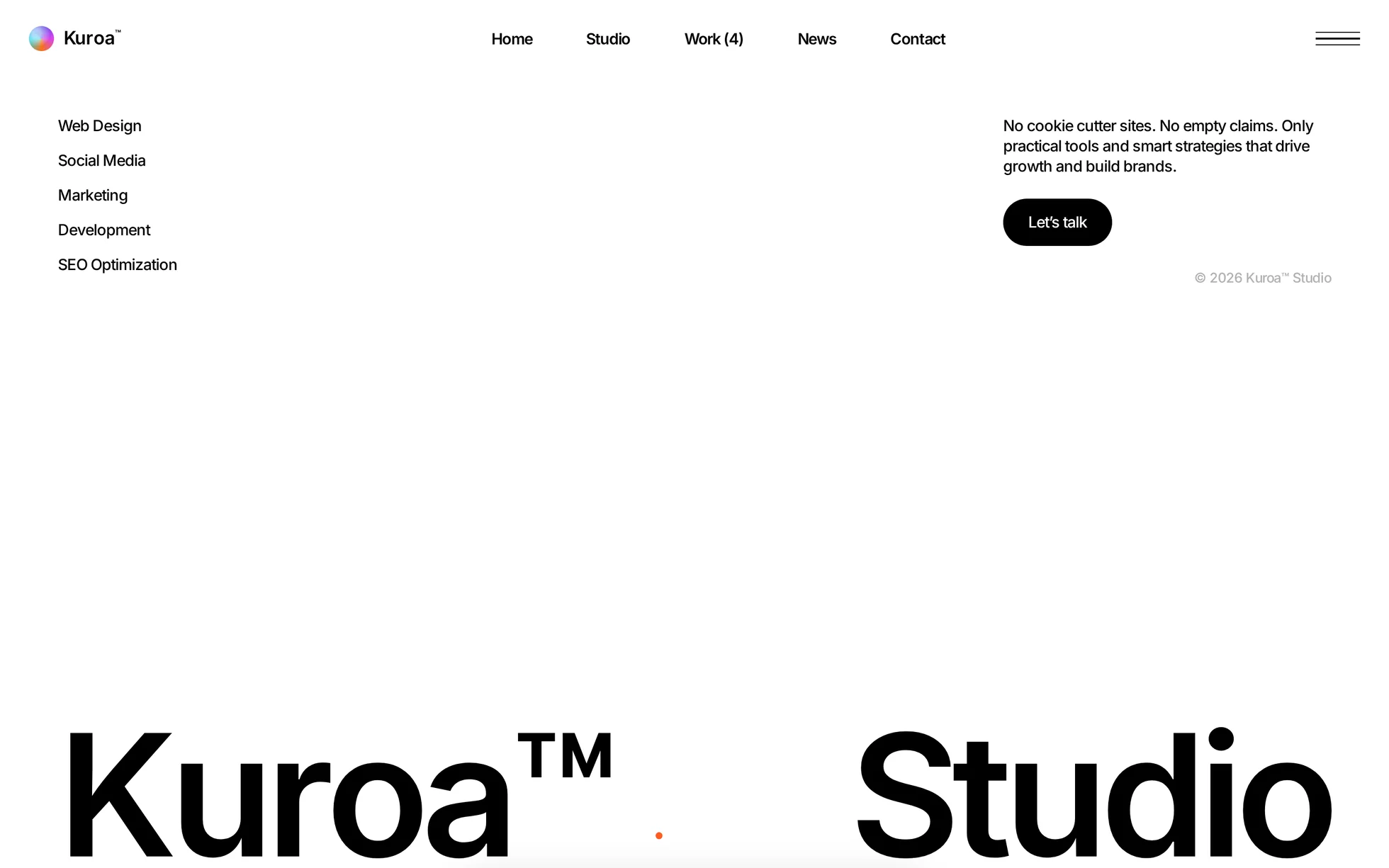
A complete site for a creative studio: a hero panel that shrinks from full screen to a card while two columns of photographs scroll behind it, a portfolio with a pinned heading, a bento about the studio, a “vision” section where five sentences take turns across eight screens, a showreel mosaic that zooms out and settles, pricing, an FAQ, four testimonials that drop and stack, the numbers, a journal, a contact block and the footer. One page, one HTML file, 30 596 px tall.
What makes this template is that four of its sections are driven by
the scroll position and none of them uses a library. A tall
section holds a position: sticky screen; one scroll listener
and one requestAnimationFrame turn the travel into a number
between 0 and 1, and the stylesheet does the rest through custom
properties — --panel-scale, --zoom,
--open, --y. No animation-timeline,
which only Chrome implements.
The design comes from a Framer template for a creative studio of which not one image remains: thirty-seven photographs were regenerated at the aspect ratios measured on the original, and the ten background videos — 14 MB — became one 596 kB reel, cut from those same stills. Every line of code was rewritten: the React bundle, the animation runtime, the smooth-scroll library, the editor badges.
That is the point: this template is not here to be admired, it is here to be read, broken and put back together.
What you change first
The colours — the accent is three shades
Right at the top of assets/css/style.css:
--ink:           #000;     /* text, buttons, the dark sections */
--paper:         #fff;     /* the page */
--paper-warm:    #f5f5f5;  /* portfolio and testimonials */
--night:         #141414;  /* hero backdrop, dark cards */
--accent:        #ff5a1f;  /* pastilles, large text — 3.11:1 on white */
--accent-strong: #d63f0c;  /* hover and small text — 4.62:1 on white */
--accent-light:  #ff8a5c;  /* accent over photography — 6.72:1 on #141414 */
The palette is monochrome and the accent only ever marks a state. But there are three accents, not one. The solid one passes on a white background at large sizes; as small text it would drop below 3:1, so the darker one takes over; over a photograph, the lightened one. Change the accent, change all three.
The name
Search for “Kuroa” in index.html: the logo, the title, the
headings, the testimonials and the footer. No CSS class contains the brand
— a find-and-replace cannot break anything. The studio mark is a conic
gradient in CSS, repeated in assets/img/favicon.svg.
The sizes
The type scale is declared once, then re-declared at each breakpoint (1200
and 810 px, the ones the source design uses). A heading therefore never
carries its own media query: change --display-size and the
hero follows — 176 px on a large screen, then 92 and 75 px on the way
down. The values are the ones measured on the original at 1440, 1024 and
390 px.
The scroll tracks
The four pinned sections are as long as they are tall:
300svh for the hero, 800svh for the vision,
400svh for the showreel, 500svh for the
testimonials. Shorten them and the page gets shorter; nothing else moves.
The thirteen effects, and how they’re built
They were not watched, they were measured: the transform of
each moving element was read at twelve scroll positions, which gives the
law it follows rather than an impression of it. The hero panel, for
instance, is a straight line from scale(1) to
scale(0.4) across 2 700 px — and it keeps shrinking after the
sticky screen lets go, which is why its progress is measured on the whole
section and not on the pinned part.
| Effect | Original settings | How |
|---|---|---|
| Shrinking hero panel | scale 1 → 0.4, linear, over 2 700 px | sticky screen, --panel-scale written per frame |
| Photo columns | two strips looping in opposite directions | list written twice, translateY(-50%) over 46 s |
| Progress bar | thin white bar at the bottom of the hero | width: calc(var(--p) * 100%) |
| Flipping partner logos | eight tiles, staggered, rotating on the horizontal axis | rotateX keyframes, 7 s, 0.45 s apart |
| Pinned portfolio heading | sticky heading, four cases scrolling past | same, position: sticky |
| Chat bubbles | cascade, looping | revealed on entry, 0.45 s apart |
| Five sentences | one at a time over 7 200 px, letters staggered | 70 % of the track for the text, 30 % for the photo; 22 ms per letter |
| Opening photograph | width and opacity tied to the scroll | width: calc(60% + var(--open) * 40%), radius closing as it opens |
| Service lines lighting up | grey → black as they pass | IntersectionObserver, 0.5 s |
| Settling showreel | scale 3.25 → 1.1 and opacity 0.3 → 1, linear, over two thirds of the section | identical, --zoom and --fade |
| Falling testimonials | four cards dropping, then stacked and tilted | −120 % of their own height, rotations 0 / −2.5 / 3 / −1.5°, counter in role="status" |
| Flipping stat cards | front and back on hover | opacity cross-fade, 0.6 s |
| Reveals | fired on the first visible pixel | corrected: 15 % from the bottom of the screen, measured on the viewport |
What you should know
No external request, no build step. Open
index.html in a browser and it works. Self-hosted fonts, local
photographs, no CDN, no tracker.
Without JavaScript, nothing is hidden. The hidden state is
written .js [data-reveal], and enhance.js is the
only thing that sets that class. Checked with JavaScript off: 12 headings
out of 12 visible, 34 animated blocks out of 34 too, the five sentences of
the vision section stack up and the four testimonials read one after
another. The four pinned sections become ordinary sections — the page then
measures 19 633 px instead of 30 596.
The reveal threshold is 15 % from the bottom of the screen, not the first visible pixel as in the original. The margin is measured on the viewport, not on the element — a threshold given as a share of the element would leave anything taller than the screen hidden for ever. A safety net reveals whatever is left when the bottom of the page is reached.
Four sections pin. A tall section holds a
position: sticky screen, and one scroll listener writes the
progress as a custom property. Which is why the root uses
overflow-x: clip and not hidden — the latter
would turn the root into a scroll container and unstick every one of them.
Under a strict security policy
(script-src 'self'; style-src 'self'): zero violations,
checked by serving the folder with the real header. No inline style, no
inline script, no onclick — the progress values go through
style.setProperty(), which the policy allows.
No horizontal overflow at 390, 1440 and 2560 px, on load
and after a full scroll. Accessibility: skip link,
aria-expanded kept truthful on the menu, native
<dialog> for the menu and the reel,
<details name="faq"> for the accordion, a single visible
focus ring, and prefers-reduced-motion that zeroes the delays
as well.
What isn’t perfect
The showreel is a montage of stills, not a film. The original played ten videos, 14 MB between them, which are not ours to redistribute. Six generated shots, pushed in slowly and cross-faded, make a 596 kB reel that is attached to the player on click — never at page load.
The animated logo is a conic gradient where the original plays a 2.4 MB video of a spinning iridescent sphere. Close enough to read as the same mark, for no weight at all.
The page is 30 596 px tall against 30 813 px for the reference (−0.7 %) at 1440 px. Section by section, the four pinned ones land to the pixel and eight of the twelve are within 2 %. The widest gap is the numbers section at −5.4 % (2 204 px against 2 329), where the original lets its cards breathe more. Nothing overlaps.
The original was a multi-page site — studio, work, news, contact, each with its own variants. Everything is folded into anchors on the single page rather than left pointing at 404s.
The newsletter form posts nowhere. It checks the address and says so plainly. Wire it to your own service.
A WebM would not have been lighter. Re-encoded at the size it is displayed: 658 kB in VP9 against 610 kB in H.264. Only the mp4 ships — serving both would hand the worse file to the browsers that prefer WebM.
Download it. Open it. Make it yours.
Kuroa is free to download, with the complete source and every local asset included.
Complete source · No account · No framework