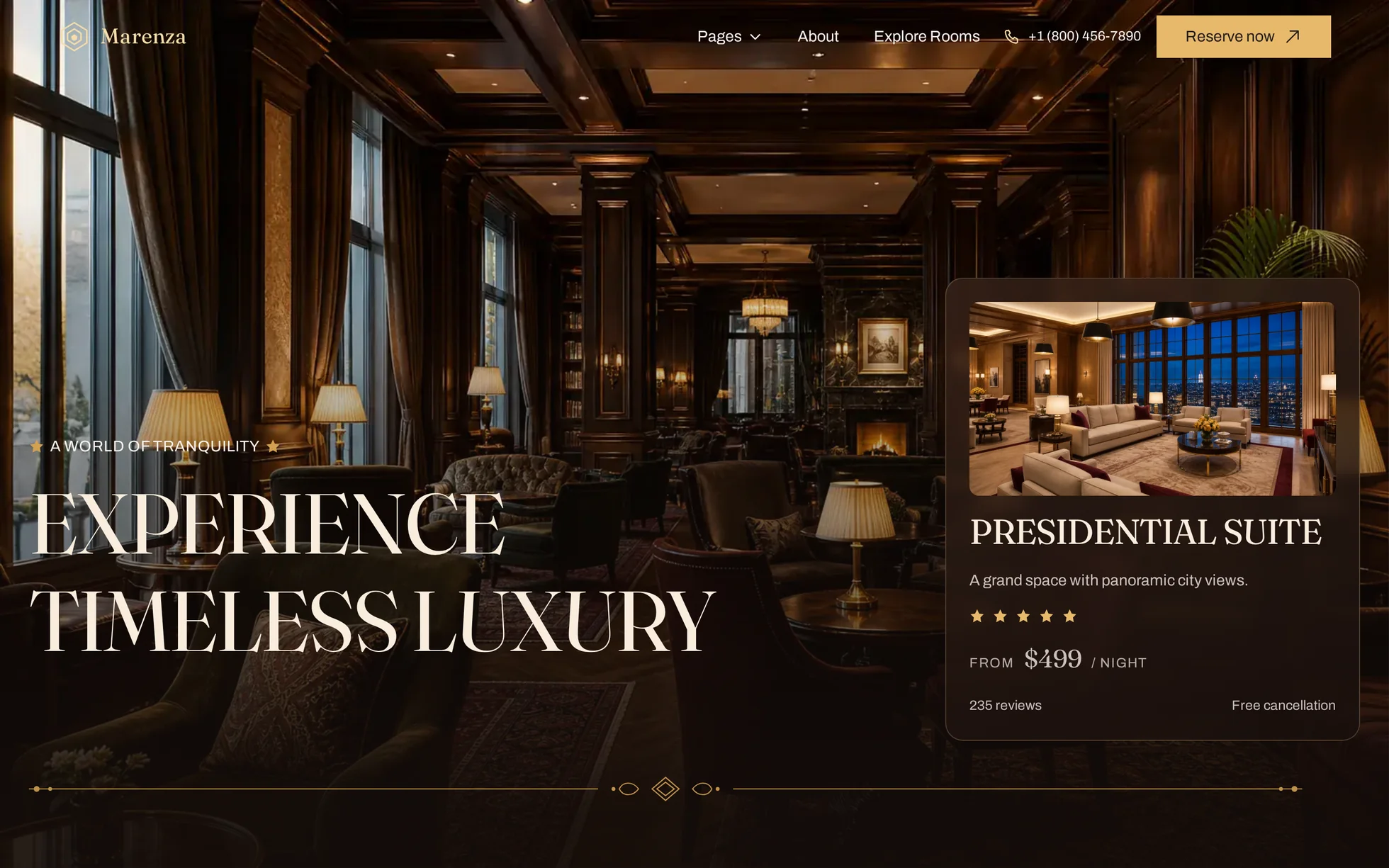
What it is
A complete site for a luxury hotel and resort: a photographic hero with a suite card laid over it, an introduction, a carousel of five suites, four selling points inside an engraved frame, a carousel of moments crossed by the name in giant type, a grid of rooms on a wine background, key figures, an accordion of experiences, a review, a staggered discovery block, a journal, a sign-up form and a footer. One page, one HTML file.
What makes this site is its hairline decoration: behind every section run a vertical rule and three one-pixel circles, and two sections sit inside an engraved frame with scrollwork. All of it is SVG drawn by hand, inside the HTML, without a single image file.
The design comes from a Webflow hospitality template of which
not one image remains: all 33 photographs were
regenerated for this template, at the exact aspect ratio measured on the
original. Every line of code was rewritten: 135 kB of minified CSS, three
Webflow bundles totalling 1.9 MB, GSAP with ScrollTrigger and SplitText,
the proprietary IX2 animation engine, two Lottie animations, an e-commerce
cart that calls an API that does not exist outside the tool, and
style="opacity:0" set inline on every animated block — which
a strict security policy blocks, leaving a blank page.
That is the point: this template is not here to be admired, it is here to be read, broken and put back together.
What you change first
The colours — ten lines
Right at the top of assets/css/style.css:
--cream:      #f8f2ed;  /* page background */
--sand:       #faeddd;  /* the "details" section, one notch warmer */
--wine:       #7b2e2e;  /* headings, full-bleed sections, footer */
--gold:       #e8b96b;  /* button background */
--gold-deep:  #d3a150;  /* the same gold, one notch darker (hover) */
--gold-soft:  #f5dca8;  /* the same gold, lightened for text on a photo */
--ink:        #211c1a;  /* strongest text */
--body:       #5c534e;  /* running text */
--line:       #e3cfc4;  /* the rules and circles of the decoration */
One thing to understand before touching anything else: there are three golds, not one. The full gold is a button background with black text on it (11.5:1). That same gold as text on the cream would drop to 2.2:1, unreadable: the lightened one takes over as soon as it has to read on a photograph or on the wine (6.9:1). Change the accent, change all three.
The name
Search for “Marenza” in index.html: the logo, the title, the
two type bands and the footer. No CSS class contains the brand — a
find-and-replace cannot break anything. The logo is a six-line SVG
<symbol>.
The sizes
The type scale is declared once, then re-declared at each breakpoint (991,
767 and 599 px). A heading therefore never carries its own media query:
change --h2 and the whole page follows — 68 px on a large
screen, then 48, 42 and 32 px on the way down.
The sixteen effects, and how they’re built
They were not watched, they were read: 151 events in Webflow’s IX2 store and 26 GSAP triggers, extracted from the original and then deduplicated — the tool creates one event per collection item. Sixteen distinct effects remain — fifteen measured, plus mouse dragging.
| Effect | Original settings | How |
|---|---|---|
| Rise from below (59 blocks) | opacity + y 100 px, 1000 ms, outQuart | [data-reveal] + IntersectionObserver |
| Staggered entrance (5 groups) | one event per card | delays of 90 / 180 / 270 / 360 ms |
| Hero settling | scale 1.1 → 1 over 2000 ms, easeInOut | a 2000 ms @keyframes |
| Bar taking a background | continuous interaction, 0 → 2 % of the scroll | one class set at 2 % of the page |
| Suites carousel | scale 0.7 → 1 and y 100 % → 0, 500 → 1000 ms | native scroll-snap; the JS only marks the middle card |
| Gallery carousel | scale 0.7 → 1 and opacity, 500 → 1200 ms | same, neighbours at scale(0.7) |
| Hover zoom (5 cards) | scale 1 → 1.1, 300 ms | scale(1.06) on the photo, the card clips |
| Experiences accordion | animated height, 500 ms / 300 ms | native <details name> + grid-template-rows |
| Picture tied to the accordion | tab swap | four stacked images, 420 ms opacity |
| Button arrow | rotation, 300 ms | rotate(45deg) on hover |
| Menu links | y −30 px, 320 ms | two copies of the label inside a clipped box |
| “Pages” menu | opens on hover | <details> + two delays, 60 and 320 ms |
| Mobile burger | Lottie animation, 300 ms | three CSS bars, same duration |
| Letter-by-letter headings | SplitText, stagger 0.3 s from the centre | replaced — see “what isn’t perfect” |
| Journal lines and titles | SplitText, xPercent, stagger 0.02 s | same |
| Mouse dragging | the original slider could be dragged | pointerdown/move/up; snapping goes quiet, and past 60 px the card changes |
What you should know
No external request, no build step. Open
index.html in a browser and it works. Self-hosted fonts, local
photographs, no CDN, no tracker.
Without JavaScript, nothing is hidden. The hidden state of
the reveals is written .js [data-reveal], and
enhance.js is the only thing that sets that class. Checked
with JavaScript off: 46 headings out of 46 stay visible, 59 blocks out of
59 too, and the accordions still open.
The reveal threshold is 15 % from the bottom of the screen, not the first visible pixel as in the original. The margin is measured on the viewport, not on the element — otherwise the hero and the rooms section, both taller than the screen, would stay hidden for ever. A safety net reveals whatever is left when the bottom of the page is reached.
The decoration sits under the content. The hairlines and circles are absolutely positioned, so they were painted after content that is not — without one stacking rung on the container they ran straight across the photographs of the journal and the discovery block.
The carousels scroll natively. Wheel, finger and keyboard all work without a line of JavaScript; mouse dragging is the one gesture the script adds: 4,320 px of travel for the 4,188 px needed on the suites, 2,100 px for 1,830 px on the gallery. The last card is reachable in both.
Under a strict security policy
(script-src 'self'; style-src 'self'): zero violations,
checked by serving the folder with the real header. No inline style, no
inline script, no onclick.
No horizontal overflow at 390, 1440 and 2560 px, on load
and after a full scroll. Accessibility: skip link,
aria-expanded on the menu, star ratings spelled out, a single
visible focus ring, and prefers-reduced-motion that zeroes the
delays as well.
What isn’t perfect
The letter-by-letter text effects were not reproduced.
The original splits its headings and brings in each letter. Doing it by
hand would mean one <span> per letter — unreadable
HTML for you, and a heading that is painful to translate. The headings
come in as one block, on the same curve and over the same duration. It is
the most visible difference between the two pages.
The page is 14,988 px tall against 15,422 px for the reference (−2.8 %): the paragraphs are slightly shorter. Nothing overlaps. The hero, on the other hand, overlays pixel for pixel: height, text column, heading, lede, card, card thumbnail, rule and bar all land 0 px from the original — and it fills the screen on arrival, checked at window heights of 700, 900, 1080 and 1300 px.
The e-commerce cart was removed. Outside the original tool it calls an API that does not exist, and a hotel does not sell by the basket. Its place in the bar is taken by the phone number, which really does dial.
The reviewer’s portrait is a monogram, not a photograph: a generated image must not carry the recognisable face of a real person, and a synthetic portrait signing a made-up review is not honest. Two initials in a wine-coloured disc do the same job.
The sign-up form posts nowhere. It checks the address and says so plainly. Wire it to your own service.
Two sections of the original carried the same heading.
The second was renamed: two identical <h2> on one page
hurt both search and reading.
It’s waiting for you in the library.
Marenza comes with the subscription, alongside the rest of the library and the full course.
Immediate access · No commitment · Cancel in one click