What it is
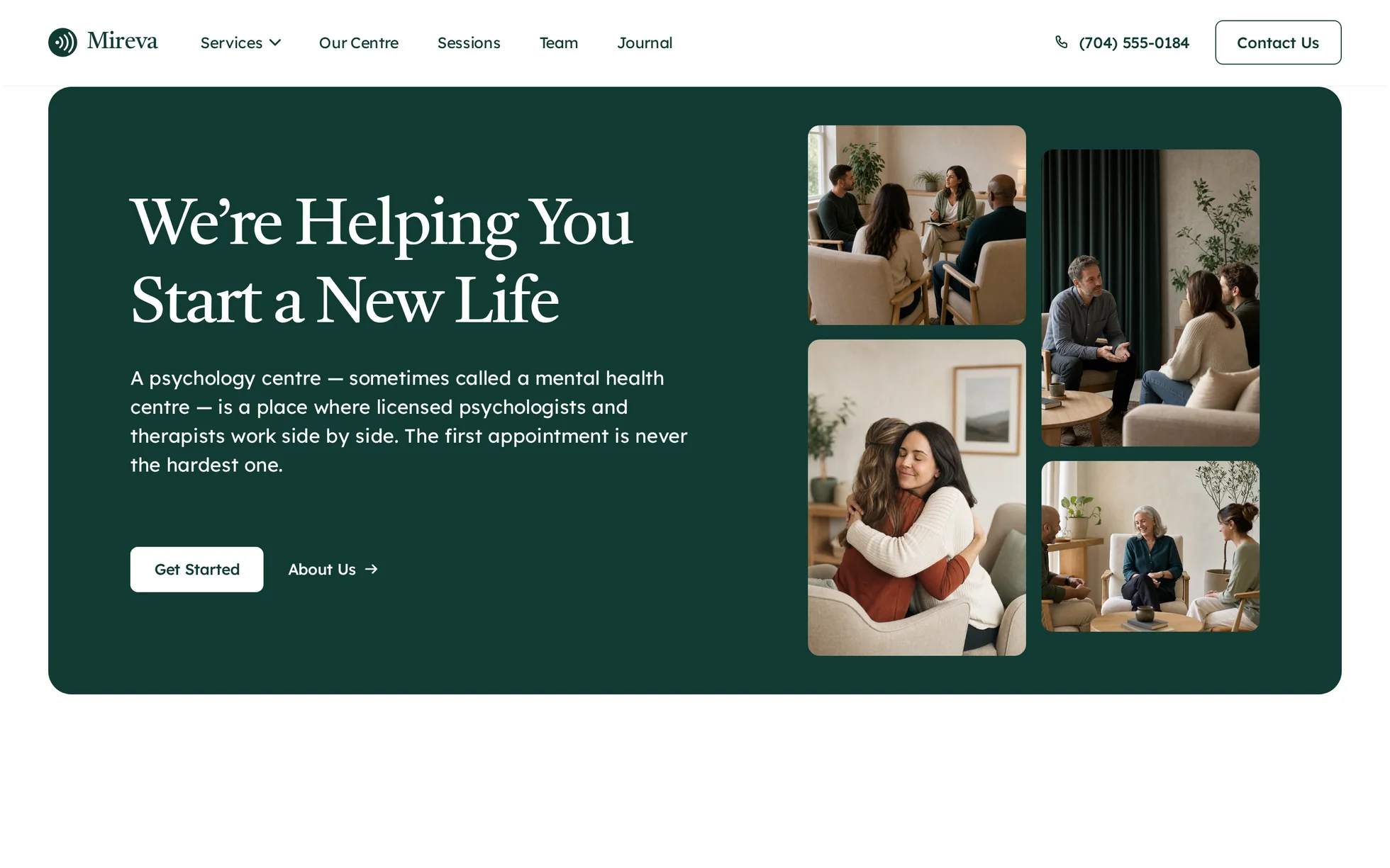
A complete psychology practice site, on a single page: a hero, three services, an introduction to the centre with two key figures, three kinds of session, four practitioners, a testimonial carousel, three journal articles and a footer with a photo band. One HTML file, one stylesheet.
The design follows that of a commercial Webflow template. None of its media survives: all twenty-one photographs have been regenerated, the eleven pictograms redrawn as SVG, and all the code rewritten. The original loaded jQuery, the IX2 animation engine, 1 MB of minified JavaScript and CSS, and set a style="opacity:0"
on every animated block — unreadable, therefore useless for learning from, and incompatible with a strict security policy.
That's the whole point: this template isn't here to be admired, it's here to be read, broken and rebuilt.
What you change first
The colours — seven lines
Right at the top of assets/css/style.css:
--ink:       #123b34;  /* hero card, solid buttons, headings */
--ink-deep:  #0b2621;  /* the same, one notch darker, for hovers */
--ink-soft:  #9ccbb8;  /* the same, lightened, the only one readable ON the green */
--mint:      #e4efe5;  /* the soft panel for sessions and reviews */
--paper:     #ffffff;  /* the background */
--slate:     #545c51;  /* body text */
--line:      rgba(84, 92, 81, .5);  /* the rules */
One thing to grasp before touching anything else: there are three greens, not one. The solid one passes AAA contrast comfortably on white (12.4:1) and on the soft green (10.5:1), but it would vanish laid over itself — that's what the lightened version is for (6.9:1 on the solid). The dark one is for hovers (16.0:1). If you change the accent, change all three.
The name
Search for “Mireva” in index.html: it's there six times, including the <title>, the two og:* tags and the footer. No CSS class carries the brand name: a find-and-replace can't break anything. The logo is three arcs in a disc, as SVG in the page, followed by the name in the template's own font — so it follows by itself.
The photos
The names say where they go: hero-01 to hero-04
for the mosaic, team-01 to team-04 for the practitioners, story-* for the reviews, journal-*
for the articles, social-* for the footer band. Each is encoded at the size it's actually displayed: replace them at equal dimensions and the weight won't move.
The sizes
The type scale is declared once, then redeclared at every breakpoint. So a heading never gets its own media query: you change --h2-size and the whole page follows.
The nine effects, and how they're built
All taken from the data of the original's animation engine — the store holds 794 events, those of every page in the template. 56 target an element on this page, and after grouping by action list there remain nine distinct effects: the editor creates one event per collection item, and the first twenty-four are the same reveal, repeated.
| Effect | Original settings | How |
|---|---|---|
| Reveal from below | 100 px, 1,000 ms, outQuart, 0% threshold | IntersectionObserver, firing 15% up from the bottom of the screen |
| Reveal from above | −100 px, 1,000 ms, outQuart | the same — it's the hero mosaic |
| Reveal from the left | −100 px, 1,000 ms, outQuart | the same — it's the centre's photo |
| Practitioner hover | scrim 0 → 1 and photo ×1.1, 500 ms | two CSS transitions; the scrim stays put on a touchscreen |
| Article hover | photo ×1.05, 700 ms | the same, as a CSS transition |
| Session hover | background change, 500 ms | the same, and the rule under the row fades at the same time |
| Footer thumbnail hover | scrim and pictogram, 500 ms | the same, in CSS transitions |
| Dropdown | height 500 ms / 300 ms, chevron 200 ms | pure CSS — :hover and :focus-within, two delays (80 ms / 300 ms) |
| Review carousel | proprietary slider, 500 ms, endless loop | scroll-snap native — no loop, see below |
What you should know
- No external requests. Every request on load is local, fonts included. The original pulled from five domains.
-
Scroll reveals can't hide the content.
The hidden state only exists once the JavaScript has run. Checked by removing the
<script>: 20 headings out of 20 stay visible, 28 paragraphs out of 28, no hidden block out of 23, the menu stays open and the carousel keeps its scrollbar. -
Zero inline styles, zero inline scripts. Checked by serving the folder over HTTP with the site's CSP — not assumed. The original, meanwhile, set
style="opacity:0"on every animated block: under a strict CSP, that's a blank page. - The trigger sits 15% up from the bottom of the screen, not at the first pixel as in the original: a block visibly enters instead of having finished before it was seen. The threshold is measured against the screen and not against the element — otherwise a block taller than the screen would stay invisible for ever. A safety net reveals whatever is left when you reach the bottom of the page.
- The dropdown has two delays, not one: 80 ms on opening so a pointer merely crossing the button doesn't make the panel flash, 300 ms on closing to cover the trip across the gap between the button and the panel.
-
Accessibility: skip link,
aria-expandedon both menu buttons, carousel position announced throughrole="status", decorations markedaria-hidden, a single focus ring visible on both backgrounds, animations switched off if the system asks — delays included. - Responsive checked at 390, 1440 and 2560 px, on load and after scrolling all the way down, with no horizontal overflow. The page is 5,510 px tall against 5,495 px for the original, a difference of 0.3%.
What isn't perfect
Better said here than left for you to find out.
-
The carousel doesn't loop. The original goes back to the first card after the last; here the arrow is disabled at the end. A native
scroll-snaptrack can't loop without duplicating the cards and correcting the position on every jump — a lot of code for a doubtful gain, and the scrollbar would lie about the number of cards. - The template's menu opened twenty-five pages. All that's left is one expanding entry, “Services”, and four anchors. The rest would have been dead links, and a dead link in a template you download is worse than a missing section.
- The “Our Center” section is 10.5% shorter at 991 px and 9.1% shorter at 767 px: its paragraph and its two figure captions are shorter than the original's, which repeats the same turn of phrase three times. At 1440 px the difference falls to 0.2%.
- The pictograms are heavier than the original's, which are finer glyphs. They're new drawings, not copies: they take the subject — one person, two people, a group, arrows bearing down on a head — and not the linework.
- The figures 68% and 17% measure nothing, as in the original. The sentence beside them at least says what they would be about: replace them with your own before publishing.
It’s waiting for you in the library.
Mireva comes with the subscription, alongside the rest of the library and the full course.
Immediate access · No commitment · Cancel in one click