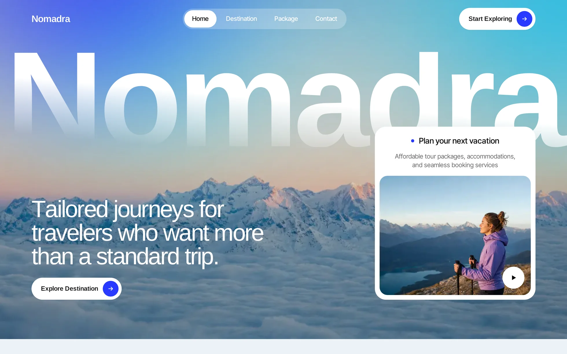
What it is
A travel agency site, complete: a photo hero with a video card, an intro with figures, destinations pinned as you scroll, packages, expandable services, experiences, selling points on a loop, a gallery carousel, reviews, an FAQ, a form, a call to action, a footer. One page, one HTML file.
The design follows that of a commercial template, of which only the
photos, the video and the copy have been kept. All the code has been rewritten: the original shipped 152 kB of minified CSS, jQuery, three bundles totalling 700 kB, GSAP with ScrollTrigger and SplitText, a smooth-scrolling engine, the vendor's own sales widget, and a style block that set visibility: hidden !important
on sixty classes until the animation engine had started. Unreadable, and therefore useless for learning from.
That's the whole point: this template isn't here to be admired, it's here to be read, broken and rebuilt.
What you change first
The colours — six lines
Right at the top of assets/css/style.css:
--color-accent:        #2739ff;  /* buttons, index numbers, icons */
--color-accent-strong: #1c2ad6;  /* the same blue, one notch darker (hover) */
--color-accent-light:  #7f8cff;  /* the same blue lightened, on dark panels */
--color-page:          #ecf2f6;  /* page background */
--color-deep:          #020e26;  /* packages band, footer */
--color-sky:           #b0dffb;  /* the pale blue “why us” band */
One thing to grasp before touching anything else: there are three blues, not one. The solid accent passes comfortably on white (6.74:1) and on the page background (5.97:1), but it drops to 2,85:1 on the footer's midnight blue — below the AA threshold. That's why the email link and the form's message use the lightened version (6.49:1). If you change the accent, change all three.
The name
Search for “Nomadra” in index.html. No CSS class carries the brand name: a find-and-replace can't break anything. One precaution only — the giant word in the hero is sized in
vw so it fills the width of the screen: seven letters at
24vw fill 1440 px; a longer name needs a smaller value.
The sizes
The type scale is declared once, then redeclared at every breakpoint. So a heading never gets its own media query: you change --h2-size and the whole page follows.
The nineteen effects, and how they're built
All taken from the data of the original's animation engine — 33 interactions and 32 timelines, pulled out of the site's bundle then measured again in the browser, not by eye — plus the gallery carousel, which was a script written by hand in the page.
| Effect | Where | How |
|---|---|---|
| Home entrance | giant word, heading, button, card | four starts staggered from 0 to 0.96 s, same durations as the original |
| Heading letter by letter | 7 sections | split by the script, 0.7 s, total stagger 0.5 s |
| Paragraph line by line | 7 sections | lines grouped by position, each in a clipping band |
| Text that lights up as you scroll | intro | letters from 20% to 100% opacity, driven by the page position |
| Curtain over the photos | intro | clip-path from 101% to 0, the second photo at 0.59 s |
| Roll counters | 3 cards | a 0-9 stack then the target digit, 2 s, 80 ms offset per column |
| Blocks rising | everywhere | IntersectionObserver, firing 15% up from the bottom of the screen |
| Pinned destinations | section 3 | a sticky block, a single progress variable written on scroll |
| Two endless loops | mobile destinations, selling points | the band written twice, translated by half its height |
| Button and link hover | everywhere | two copies of the label in a clipping box, the second replaces the first |
| Card hover | destinations, packages, experiences | photo growing or widening, arrow leaving to the right |
| Service rows | 4 rows | <details> native, animated height, opens on hover and on keyboard focus |
| Coverflow carousel | gallery | positions and scales written as CSS variables; without JS, a band you swipe |
| Accordions | 6 questions | <details> native, height animated by the Web Animations API |
| Footer logo | footer | masked letters rising, 1 s, 0.5 s stagger |
What you should know
- No external requests. 44 requests on load, all of them local. The original loaded jQuery, three Webflow bundles, GSAP, Lenis and two Google fonts from five domains.
-
Scroll reveals can't hide the content.
The hidden state only exists once the JavaScript has run. Checked by removing the
<script>: 25 headings out of 25 stay visible, all 3 curtains are up, all 10 accordions open, and the gallery stays a band of 7 photos you can swipe. -
Zero inline styles, zero inline scripts. The template honours the site's strict security policy — the very one the original's
visibility: hiddenmade impossible to satisfy. - The trigger sits 15% up from the bottom of the screen, not at the first pixel as in the original, and it's measured against the screen and not against the element: a threshold as a percentage of the element would leave any block taller than the window invisible for ever.
- The video is only requested on click. The original serves a 1280 × 720 file in a 384 × 303 card and starts it on load; here the card shows a 13 kB image until you press play.
-
Accessibility: skip link, menu state announced, the position of both carousels announced, native FAQ and services so they work from the keyboard, visible focus, split text restored through
aria-labelso it isn't spelled out, animations switched off if the system asks. - Responsive checked at 390, 1440 and 2560 px, on load and after scrolling all the way down, with no horizontal overflow.
What isn't perfect
Better said here than left for you to find out.
- The page is 0.1% shorter than the reference at 1440 px (14,724 px against 14,732), +1.1% at 991, +1.2% at 767 and +5.8% at 479 px. Section by section the difference runs from −9% to +7%: my copy isn't exactly the same length. Nothing overlaps.
- The giant word says “Nomadra”, not “Travelo”. The original shows one brand large and another in the navigation bar. Both words are seven letters long, so the layout doesn't move.
- The selling-point carousel loops in 20 s, not 10. At the original's speed, a three-line card crosses the screen before it can be read.
- Seven distinct photos in the gallery, against four. The original repeats the same image on four of the seven cards. Two of the seven are only supplied at 279 × 286 and 333 × 380 and are displayed at 340 × 432: they're softer than the rest.
- The three reviews have three different texts, and two section headings have been rewritten: the original repeated the same quotation three times and the same heading on two sections.
-
The form sends nothing. There's no server in a template: the submission is intercepted and answered on the spot. Point
actionat your own endpoint. - The photos and the video come from the original template, several are visibly AI-generated and the video's file name is that of a paid stock library. The code is yours; for the visuals, check the licence or replace them. The fonts themselves are free to redistribute.
It’s waiting for you in the library.
Nomadra comes with the subscription, alongside the rest of the library and the full course.
Immediate access · No commitment · Cancel in one click