What it is
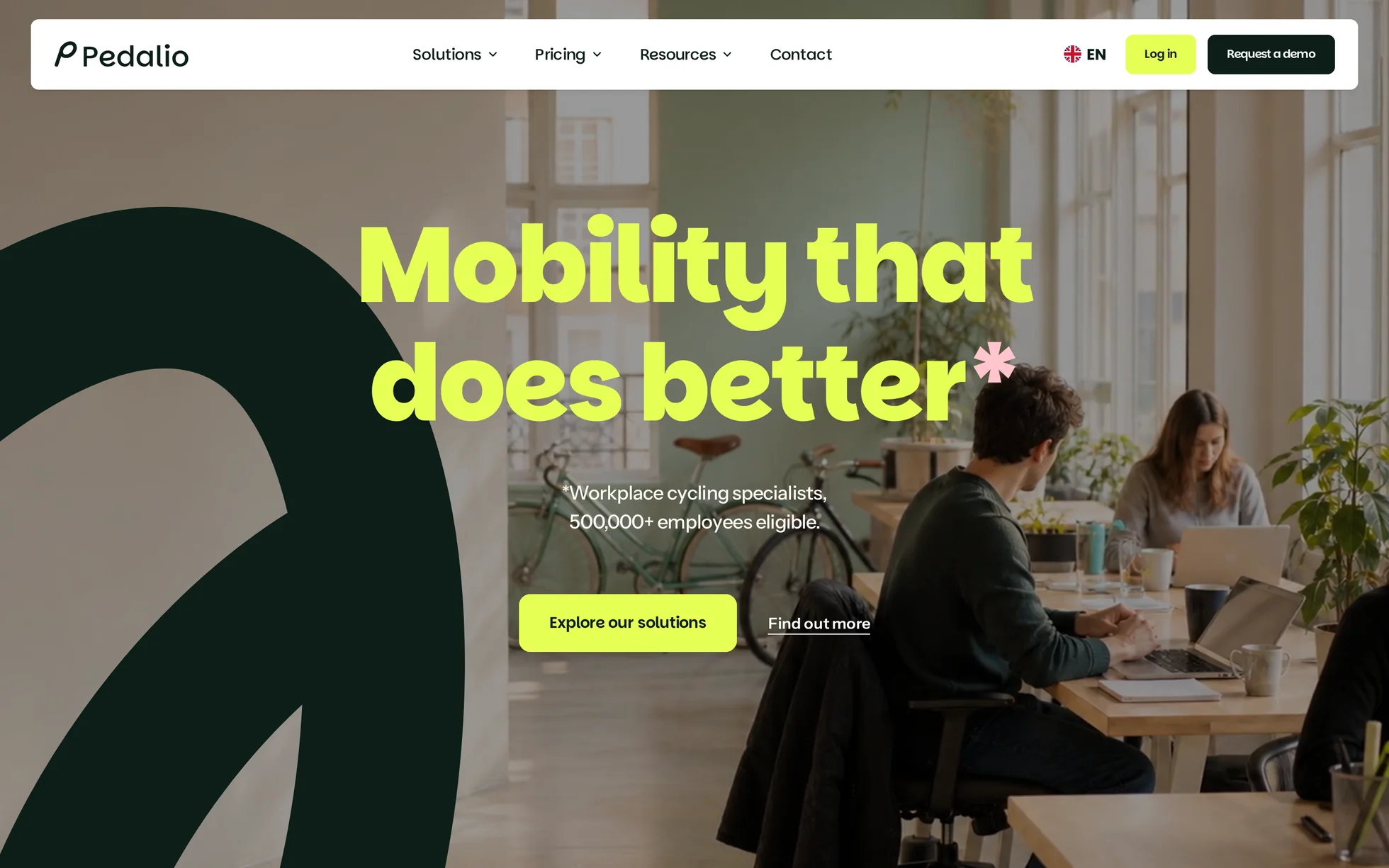
A complete B2B marketing site, for a company selling company bikes to employers: a video hero, client logos, the promise, a three-step approach, benefits with an employer / employee toggle, four statistics stacking over a photo, a marketplace, partner brands, a CO₂ calculator, a shop network, testimonials, an FAQ, a call to action, a footer. Thirteen sections, one page, one HTML file.
The original is a Nuxt site driven by a CMS: a full application, GSAP and its scrolling engine, an animated preloader and a JavaScript bundle of 976 kB on its own. All the code has been thrown away. What was kept: the structure, the design, the copy, the photos and the video.
That's the whole point: this template isn't here to be admired, it's here to be read, broken and rebuilt.
What you change first
The colours — six pairs
The site never paints a card directly: it picks a
pair, a background and the text colour that goes with it. Six pairs, at the top of assets/css/style.css:
--green-deep: #005236;  /* headings, main surfaces */
--lime:       #e6ff55;  /* the loud accent: hero heading, CTA */
--violet:     #4b1a9a;  /* pair 1 — “Bien-être”, marketplace */
--orange:     #e54c1e;  /* pair 2 — “Santé” */
--navy:       #033968;  /* pair 3 — “Absentéisme”, shops */
--mint:       #d4f5e0;  /* pair 4 — “Impact” */
One thing to grasp before touching anything else: there are three greens, not one. The deep green passes AA contrast on the cream (8.2:1) and on white (9.3:1), but it vanishes into a photo. It's the fluorescent yellow that holds up on the hero video and on the dark footer (15.5:1). If you change one, check all three.
The size of the whole page — one line
Every dimension on the site is in rem, and the root is
0.6944vw, i.e. exactly 10 px on a 1440 px screen. Divide a mock-up pixel by 10 and you have the value in rem:
9.6rem means “96 px in the mock-up”. Change that one line and the whole page grows or shrinks as one.
The name
Search for “Pedalio” in index.html. No CSS class carries the brand name: a find-and-replace can't break anything. The logo is in assets/img/logo.svg, in two colours.
The fourteen effects, and how they're built
All taken from the original's bundle — durations, curves, offsets, thresholds — then measured in the browser, not by eye. Two curves cover the whole site: cubic-bezier(.77,0,.175,1) for entrances,
cubic-bezier(.645,.045,.355,1) for the interface.
| Effect | Where | How |
|---|---|---|
| Panels stacking in 3D | 4 statistics, 4,700 px | position: sticky for the stacking, a single number written by the JS for the tilt (4°, 36° in X, ×0.8) |
| Sweeping button | 17 buttons | two panels tilted at −12° rise 42 ms apart, the label leaves through the top and a copy comes back from below on a spring |
| Heading word by word | 9 headings | each word in a clipping box, 1 s, 30 ms between two words |
| Shape drawn in outline | 7 brand squiggles | stroke-dashoffset animated over 2.5 s; the hero's stops at 1,380 units out of 1,975 |
| Scroll reveal | 14 blocks | IntersectionObserver, firing 15% up from the bottom of the screen |
| Tabs that advance on their own | approach, 3 steps | native radio buttons + :has(); the JS adds the 4 s advance and stops at the first click |
| Pill toggle | Entreprises / Salarié·es | two radio buttons, a pill sliding in 0.5 s, the two grids superimposed |
| Curtain over the photo | approach | clip-path rising in 1.2 s, the photo goes from ×1.2 to ×1 |
| Background that changes colour | approach | the section takes the two colours of the active step, 0.8 s transition |
| Marquees | 2 marquees | the list written twice, translated by −50% over 16 s, a gradient mask at the edges |
| Parallax | the “600 €” card and 2 pills | the JS writes a distance in pixels, the CSS keeps the rotation |
| Curtain footer | end of page | it starts 25% higher than its slot and settles into place over the last screen |
| Carousel | 3 testimonials | native scroll-snap: dragging, swiping and the keyboard all work without JS; auto-advance every 8 s |
| Accordions | 8 questions | <details> native; the plus becomes a minus in 0.4 s |
What you should know
- No external requests. Everything is local: fonts, photos, video, logos. The original loaded two CDNs and a CMS preview tool.
- Scroll reveals can't hide the content. The hidden state only exists once the JavaScript has run. Checked by switching the scripts off: 22 headings out of 22 stay visible, the 8 FAQ answers are readable, the 7 shapes are drawn.
-
Zero inline styles, zero inline scripts. The template honours the site's strict security policy — the very one a
style="opacity:0"breaks. -
The toggles work without JavaScript. The approach tabs and the audience selector are native
<input type="radio">elements;:has()takes care of showing the right panel. The JavaScript only adds the automatic advance. -
A single scroll loop. Stacking, parallax and footer all go through one listener and one
requestAnimationFrame— three separate listeners means a page that stutters. - Accessibility: skip link, menu states announced, native FAQ, carousel position announced, a single visible focus style, decorations hidden from screen readers, animations and delays switched off if the system asks.
- Responsive checked at 390, 1440 and 2560 px, on load and after scrolling all the way down, with no horizontal overflow.
What isn't perfect
Better said here than left for you to find out.
- The statistics' background photo is soft. It's displayed at 1440 × 900 while the largest version the original serves is 900 × 547. The flaw comes from the source, not from the re-encoding; the panels cover 90% of it.
-
The root scale has been fixed. The original let
1remfall to 5.3 px between 769 and 1024 px: body text was 10 px there, unreadable on a tablet. An 8 px floor sorts that out, and a ceiling avoids the −25% jump the original inflicted on itself at exactly 2560 px. -
The hero's shape deliberately stops at 70% of its path.
In the original, the animation stays stuck halfway; drawing the whole stroke would have added a second arc across the video. The length drawn is a variable,
--draw. -
Three flaws in the original have been removed:
word-break: break-allon the whole body (which broke words anywhere),user-select: noneon every element (you couldn't copy anything) and:focus { outline: none }with no replacement (the keyboard lost the cursor). - The original site has several pages. Here all the links lead back to an anchor on the page rather than to a 404. The “Connexion” button, which pointed at an application, leads to the contact section.
- The mega menu has become a simple panel. The original opens a full-screen panel with images; here the three entries open a list of links beneath them, on hover as on click.
- The page is 0.6% shorter than the reference (14,675 px against 14,766). The difference is in the FAQ, whose answers spread over fewer lines. Nothing overlaps.
- The palette's two oranges are weak. The pink text on the orange card falls to 2.6:1, the orange on its pale background to 3.5:1: one passes nowhere, the other only for headings. Both come straight from the original and are kept to stay 1:1; the README says what to change for a real site.
- The photos, the video and the brand logos come from the original site. The code is yours; for the visuals and the name, check before publishing. Both fonts are free to redistribute.
It’s waiting for you in the library.
Pedalio comes with the subscription, alongside the rest of the library and the full course.
Immediate access · No commitment · Cancel in one click