What it is
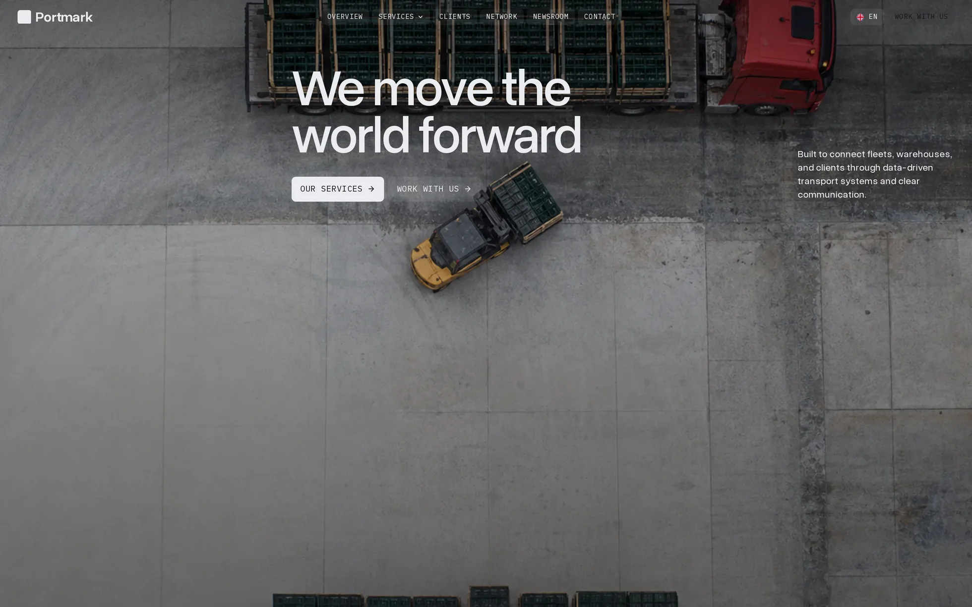
A freight company's site, complete: a full-screen hero, four services on a rail, a frame that grows to full screen as you scroll, a case study, a logo band, a testimonial with figures, a globe and its fourteen countries, six news cards, an FAQ, a closing call, a footer. One page, one HTML file.
The design follows that of a commercial Webflow template, of which nothing visual has been kept: the fifteen photographs were regenerated for this template, and its three background videos became still images at the same framing. All the code has been rewritten: the original came to 383 kB of minified CSS, jQuery, four Webflow bundles, a proprietary animation engine, GSAP with three plugins, and a 3D scene streamed as WebAssembly from another domain. Unreadable, and therefore useless for learning from.
That's the whole point: this template isn't here to be admired, it's here to be read, broken and rebuilt.
What you change first
The colours — four lines
Right at the top of assets/css/style.css:
--paper:      #eaecef;  /* page background, light sections */
--paper-lift: #d7dade;  /* raised light sections */
--ink:        #14161a;  /* text, and the dark sections */
--ink-lift:   #23262c;  /* raised dark surfaces */
One thing to grasp before touching anything else: this design has no accent colour at all. It is four neutrals and nothing else — the original declares one accent and never uses it on the page. The single colour in the template is the keyboard focus ring, and it exists in two shades because it has to hold on both surfaces: #2f6df0 on the light one (4.9:1) and #7aa5ff on the dark one (7.4:1). Change one and re-check the other.
The name
Search for “Portmark” in index.html. No CSS class carries the brand name, and the logotype is a word set in the template's own typeface rather than an image: a find-and-replace can't break anything.
The sizes
The type scale is declared once, at the top, as a set of clamp() values. A heading never gets its own media query: you change --h2-size and the whole page follows. The only rules under @media are layout rules.
The fourteen effects, and how they're built
All taken from the data of the original's two animation engines — 113 Webflow events on this page, 42 distinct once deduplicated, plus 26 GSAP scroll triggers carrying 68 tweens. Read out of the stores, then measured in the browser, not by eye.
| Effect | Where | How |
|---|---|---|
| Headings rising line by line | 12 headings | the JS splits them into lines after the webfont loads, each line rides out of its own mask |
| Scroll reveal | 20 blocks | IntersectionObserver, firing 15% up from the bottom of the screen |
| Text that fills in | the services pitch | words light up one after another across the scroll, no library |
| Frame that grows | between services and clients | the JS writes a progress variable, the CSS turns it into a width, a height and a corner radius |
| Hero parallax | home | the photo drifts at 18% of the scroll, scaled up so no edge is ever uncovered |
| Bar that flips light and dark | 7 sections | the fixed bar reads the theme of whatever section passes under it |
| News photo on hover | 6 cards | fades in over 200 ms while it settles back from a 5% zoom, as in the original |
| Service photo zoom | 4 cards | scale: 1.04 over 750 ms |
| Buttons | everywhere | a background wipe grows from the bottom edge, the label inverts with it |
| Underline that sweeps | case study link | translateX from −100% to 0 |
| Date giving way to “Read article” | 6 cards | two cells stacked in one grid area, sliding by 110% |
| Marquees | logos and footer | two identical rows and CSS keyframes — no JS, and they pause on hover |
| Mega-menu | navigation | a <details>: opens on click with no script, plus 90 ms to open and 260 ms to close on a pointer |
| Carousels | services and news | native scroll-snap: dragging, swiping and the keyboard all work without JS |
What you should know
- No external requests. 22 requests on load, all of them local. The original pulled jQuery, four bundles, GSAP and a WebAssembly 3D runtime from four domains.
-
Scroll reveals can't hide the content.
The hidden state only exists once the JavaScript has run. Checked by removing the
<script>: 12 headings out of 12 stay visible, the six questions still open, the growing frame sits at its final size. The original, meanwhile, hides two dozen selectors behindvisibility: hiddenuntil its engine starts. -
Zero inline styles, zero inline scripts. Verified by serving the folder with the strict policy from
_headers, not assumed. - The trigger sits 15% up from the bottom of the screen, not at the first pixel as in the original: a block visibly enters instead of having finished before it was seen.
-
The body text is readable. The original sizes everything in
vwagainst an 1800 px canvas with no floor, so its body text lands on 12.8 px at 1440 and 8.8 px at 991. Here the scale stays proportional but every value is floored — the large headings match the original to within a tenth of a pixel, only the small text is lifted. - Accessibility: skip link, menu state announced, native FAQ, carousel position announced, visible focus in two shades, decorations hidden from screen readers, animations switched off if the system asks — delays included.
- Responsive checked at 390, 1440 and 2560 px, on load and after scrolling all the way down, with no horizontal overflow.
What isn't perfect
Better said here than left for you to find out.
- The globe is a still image. The original streams a photoreal 3D earth as about 2 MB of WebAssembly from another domain. That's a dependency this template won't take, so it's one image with a slow drift and a breathing halo. Same drawing, same framing — the volume and the interaction are gone. It is the most visible difference of the whole page.
- The three background videos became still images at the same framing. A video from an export is almost never redistributable, and those three weighed 9.5 MB in MP4 alone — for a template that now comes in under two. The frame still grows as you scroll; only the motion inside it is gone.
- The news card photo only shows on hover, as in the original. There is no hover on a touchscreen, so on a phone that photo is never seen. It does appear on keyboard focus, which the original doesn't do.
- Splitting the headings into lines costs a reflow when the webfont loads and on every real width change. That's the price of masks that break in the right place at any width.
- The exclusive accordion needs a recent browser — Chrome 120, Firefox 130, Safari 17.2. On anything older it still opens and closes, but several questions can stay open at once.
It’s waiting for you in the library.
Portmark comes with the subscription, alongside the rest of the library and the full course.
Immediate access · No commitment · Cancel in one click