What it is
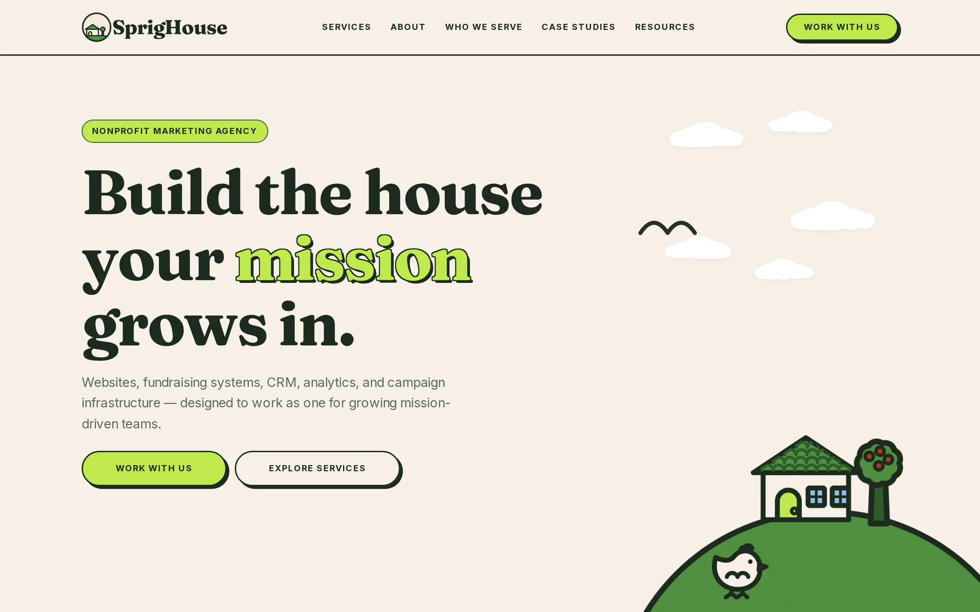
The site of an agency that builds websites, donation systems and CRMs for charities: an illustrated hero, a key figure, an intro, a carousel of nineteen reviews, audiences served, a band of certified partners, case studies, a four-step method, a contact form, a call to action, a footer. One page, one HTML file.
The design, the structure, the copy and the images follow sprighouse.co. All the code has been rewritten. The original is a Next.js application: React, compiled Tailwind, an animation bundle, a client-side router and a server-side image optimisation layer. None of it is readable, none of it opens without a server, and none of it survives this site's strict security policy.
What's left fits into three files: one HTML, one stylesheet, one script. That's the whole point: this template isn't here to be admired, it's here to be read, broken and rebuilt.
What you change first
The colours — six lines
Right at the top of assets/css/style.css:
--bg:      #f7f0e6;  /* page background, cream paper */
--surface: #f3ebdd;  /* sections one step forward */
--text:    #1d2b1f;  /* ink: text, borders, dark panels */
--muted:   #5c6b5e;  /* secondary text on the cream */
--primary: #bfea4b;  /* lime green: buttons, highlights, dots */
--accent:  #b8331b;  /* required-field asterisks, errors */
One trap to know before touching it: the lime green is a background colour, not a text colour. On the cream it gives 1.2:1 — unreadable. The word “mission” in the hero heading only holds up thanks to its 1.5 px ink outline. On dark panels, never mix an rgba() by hand: use --on-ink,
--on-ink-soft ou --on-ink-faint, the only three levels that pass on contrast.
The name
Search for “SprigHouse” in index.html. No CSS class carries the brand name: a find-and-replace can't break anything.
The sizes
The type scale is declared once, as clamp()
fluid values measured on the original. So a heading never gets its own media query: you change --fs-h2 and the whole page follows, at every width. Part 9 of the stylesheet contains layout changes only.
The fourteen effects, and how they're built
All taken from the original's code: the animation engine's settings are in the bundles, in plain sight — durations, curves, offsets, thresholds. Extracted by script, not guessed by eye.
| Effect | Original settings | How |
|---|---|---|
| Staggered hero entrance | 0.1 s stagger, y 24→0, 0,5 s | four animation-delayvalues, pure CSS — nothing can stay stuck at opacity: 0 |
| Five drifting clouds | 18 to 24 s, negative delays, four steps | un @keyframes, one amplitude variable per cloud |
| A bird crossing the sky | −42% → 142% in 30 s, fading at 7% | three @keyframes on two nested elements |
| Partner marquee | translateX 0 → −50% in 55 s | the track holds the eight logos twice; pauses on hover and on focus |
| Tooltip on a logo | opacity 200 ms | :hover and :focus-within. The logo is a <button>: a tap opens the tooltip, without JavaScript |
| Scroll reveal | 3 cards, 0.42 s, 50 ms stagger | IntersectionObserver, firing 15% up from the bottom of the screen |
| Preview zoom | scale(1.04), 700 ms | the same |
| Carousel of 19 reviews | auto-advance 7.2 s, 0.35 s fade | track scroll-snap: it slides, swipes and can be reached from the keyboard without JavaScript |
| Navigation underline | clip-path, 500 ms | a 3 px bar revealed from the left, crisp at any width |
| Dropdown panel | opens immediately, closes after 200 ms | CSS alone, two delays; :has() tints the bar lime green |
| Full-screen menu | clip-path 0.42 s, staggered entries | un <details> — it opens without JavaScript |
| Buttons with a hard shadow | hover +2 px, press +3 px, 120 ms | the same |
| Cards that lift | −2 px, shadow 6 → 8 px, 180 ms | the same |
| The “Read →” arrow | translateX(4px), 200 ms | the same |
What you should know
- No external requests. Ten requests for the first screen, 280 kB, all of them local. The dropdown's six thumbnails are only downloaded when it opens — 74 kB less on load.
-
Scroll reveals can't hide the content.
The hidden state only exists once the JavaScript has run. Checked by removing the
<script>: 19 headings out of 19 stay visible, no block is hidden, and the nineteen reviews can be scrolled by hand. -
Zero inline styles, zero inline scripts. The stagger of the three case-study cards is written as a
:nth-child()in the stylesheet, not asstyle="--reveal-delay: 50ms": astyleattribute would be blocked by the site's security policy. - The trigger sits 15% up from the bottom of the screen, measured against the screen and not against the element — the original fired at the first visible pixel, so a card had finished appearing before you could see it.
- Two colours have been darkened to pass AA contrast: the secondary text (4.0 → 5.0:1) and the required-field asterisk (4.4 → 5.0:1). The difference is invisible to the eye.
-
Accessibility: skip link, menu states carried natively by the
<summary>elements, carousel position announced, a single visible focus style, decorations hidden from screen readers, animations switched off and delays reset to zero if the system asks.
What isn't perfect
Better said here than left for you to find out.
- The page is 0.2% taller than the reference at 1440 px, 1.7% at 767 px, 1.8% at 479 px and 3.3% at 991 px. At 991 px, two headings wrap onto one more line than in the original; at 479 px, the key-figure card is centred over three lines instead of two. Nothing overlaps at any of the six widths measured.
-
The review carousel slides instead of fading.
The original cross-faded the reviews, driven by React: without JavaScript, only one stayed on screen. Here the track is a native
scroll-snap, and all nineteen reviews are reachable whatever happens. - One illustration has been replaced. The site mirror only held the farmer from the contact block as a 256 px JPEG with no alpha channel — a black square on the cream. Another illustration from the same series, available as transparent WebP, takes its place.
- The original site has around thirty pages; this one has one. All the links have been brought back to internal anchors rather than leaving 404s, including the menu's two dropdown panels.
-
The contact form has no server. It validates natively then shows a message pointing to the email address. Wire
actionup to your own handler and delete block 5 ofmain.js. -
The eight partner logos are registered trademarks, and two of them are certification badges. The three case-study previews are screenshots of real clients' sites. Replace them. The fonts are under the OFL and are redistributable — checked in their
nametable, not assumed.
It’s waiting for you in the library.
SprigHouse comes with the subscription, alongside the rest of the library and the full course.
Immediate access · No commitment · Cancel in one click