What it is
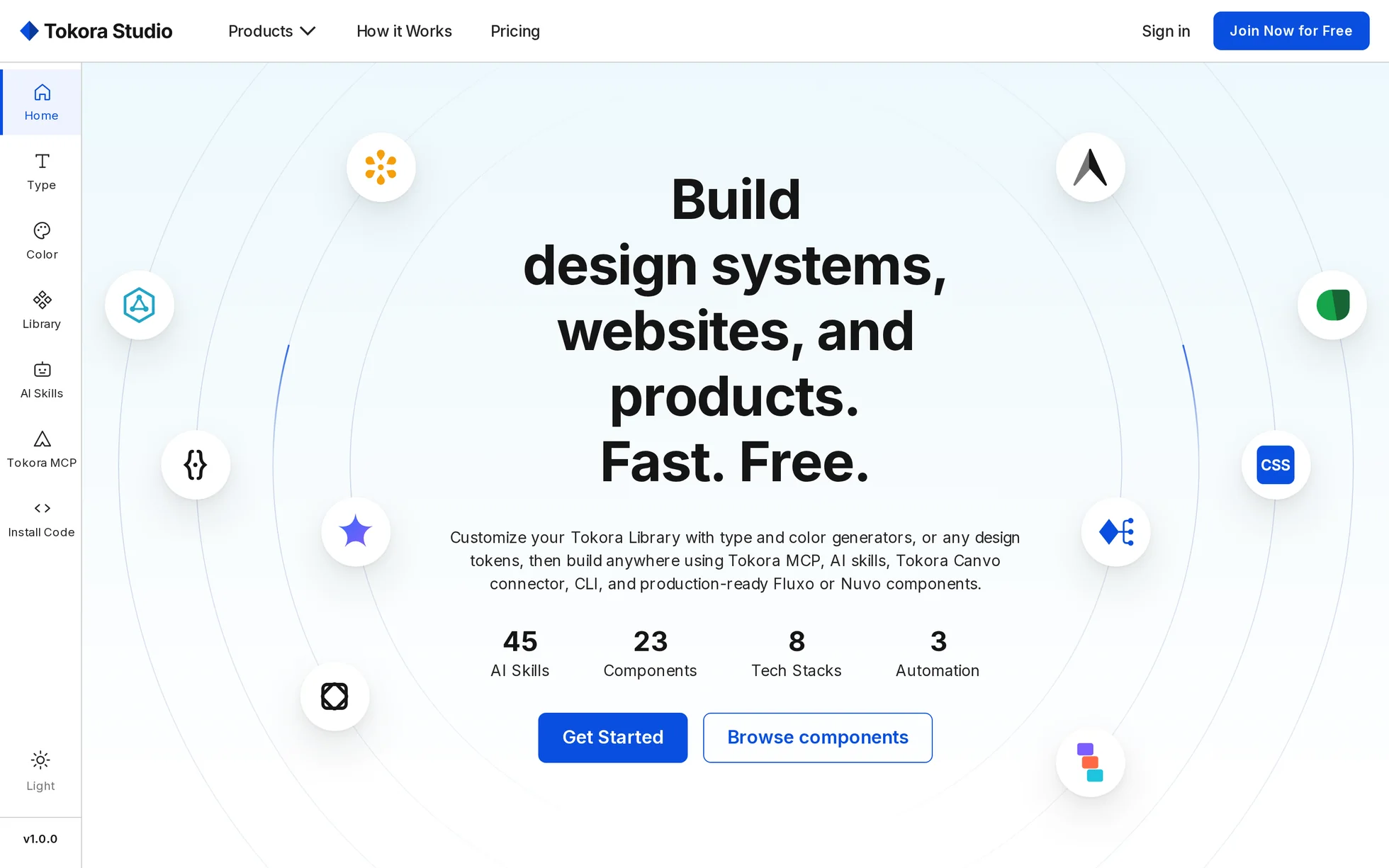
The home page of a tool that builds design systems: type scales, palettes, components, then export to React, Vue, Figma and AI agents. Twelve blocks on a single page — hero, six product cards, a six-step journey, a component library, a connection diagram, five use cases, benefits, pricing, an FAQ, a call to action, a footer.
It's the most product-like template in the library, and the most animated. Four sections stay pinned to the screen while you scroll: the hero, the journey, the library and the connection diagram. A fifth drags a horizontal carousel with the vertical scroll.
The original is a React application with a 14 MB bundle, plus 834 kB of CSS. All that code is gone. What's left is the images, the composition, the copy — and the animation settings, which were read out of the original stylesheet rather than eyeballed.
What you change first
The colours — five lines, but three blues
Right at the top of assets/css/style.css:
--blue:        #0a4fdf;  /* solid buttons, links, accents — 5.99:1 on white */
--blue-hover:  #134cc8;  /* hover — 6.87:1 */
--blue-deep:   #0b3a9d;  /* blue text on a grey background — 9.35:1 */
--blue-onblue: #ffffff;  /* text on the blue panel — 6.16:1 on --blue */
--ink:         #151515;  /* headings */
--body:        #242424;  /* body text */
There are three blues, not one. The solid blue passes on contrast against white, but it disappears as soon as you lay it on the large blue panel in the “components” section — hence the fourth shade. If you change
--blue, change all four, and check all four ratios again.
Dark mode
It's a second set of the same tokens, thirty lines further down. Nothing else needs touching: no layout rule is duplicated. The toggle is in the rail, remembered, and prefers-color-scheme
decides the first visit.
The pacing of the pinned sections
A pinned section is a height and nothing else:
--progress runs from 0 to 1 over the height minus one viewport. The hero is 175dvh, the journey 600dvh, the library 260dvh, the diagram 520dvh. Shortening speeds the animation up, lengthening slows it down.
The name
Search for “Tokora” in index.html. No CSS class carries the brand name: a find-and-replace can't break anything.
The eighteen effects, and how they're built
All taken from the original stylesheet — 834 kB, including 28
@keyframes blocks — then measured in the browser. Tokora's signature curve is cubic-bezier(.22, 1, .36, 1), its reference duration 0.92 s.
| Effect | Where | How |
|---|---|---|
| Scroll reveal | 14 blocks | IntersectionObserver, firing 15% up from the bottom of the screen, with a safety net at the end of the page |
| Ten drifting logos | home | polar placement (radius, angle), the angle advances 8° while the page stays pinned |
| Logo turning into a token | home | two opacities in clamp(), a different switching point per logo |
| Explanatory tooltip | home | hover, focus — and a guided tour that opens one every 2.6 s |
| Entrance of the six scenes | product cards | 0.92 s, an 80 px rise with a 1.5% overshoot at 70% |
| Clicking cursor | 2 scenes | a 3.6 s path on a loop, a click ring that grows and fades |
| Font list | type scene | steps(1) over 9 s, four steps |
| Typing caret | AI scene | 0,84 s step-end, plus three waiting dots staggered by 0.15 s |
| Tiles that flip | components scene | 24 circles, rotateY 0 → 90 → −90 → 0 in 0.56 s, staggered by 60 ms |
| Floating logos | stacks scene | 3.2 s back and forth, offset index × 90 ms |
| Six-step journey | pinned section | one sixth of the scroll per step, a fixed toolbar, the panel changing in 0.28 s |
| Word that flips | library heading | rotateX(±90°), 600 px perspective, four words, 2.4 s |
| Three marquees | library | the band duplicated by the script, speed in pixels per second — not a fixed duration |
| Folder filling up | diagram | six pills, a tick, a dotted thread and a fan, all driven by --progress |
| Horizontal track | use cases | 5,255 px of translation commanded by the vertical scroll |
| Accordion | FAQ | <details name> native: only one open, and the animation replayed by hand |
| Mega menu | top bar | two delays — 90 ms on opening, 280 ms on closing, long enough to cross the gap |
| Video on click | use cases | the poster is a button; the 276 kB only leave if you press it |
What you should know
- No external requests. Checked at all three widths: 0 requests outside the folder. The original loads 15.2 MB from two domains before showing its first heading.
- 426 kB on the first visit. The two videos (0.5 MB) only leave on click, the mega menu's four screenshots only when it opens.
-
Without JavaScript, nothing is hidden. The hidden state only exists under
html.js. Remove the two<script>: all 32 headings stay visible, the journey's panels stack, the carousel can be swiped, the FAQ opens. -
Zero inline styles. The ten polar positions of the hero's logos, which would naturally be
styleattributes, are in the stylesheet — one rule per tool. The site's strict security policy requires it, and it reads better. -
IntersectionObserver, neveranimation-timeline. The original uses both; the second only exists in Chrome. -
Accessibility: skip link, mega menu and drawer states announced, carousel position through
role="status", visible focus, decorations hidden from screen readers, and aprefers-reduced-motionthat also resets the delays to zero. - Responsive checked at 390, 1440 and 2560 px, on load and after scrolling all the way down, with no horizontal overflow.
What isn't perfect
Better said here than left for you to find out.
-
The font isn't the site's. The original declares
Satoshibut never loads the file: every visitor sees their own system font. The template serves Inter, the only font the site actually loads, self-hosted. That's the main cause of the differences in height. -
The scrolling is the document's. The original scrolls an inner container beneath a fixed bar and rail. Here the page scrolls normally — same rendering, half the code, and
IntersectionObserverno longer needs a root container. - The six animated scenes are reconstructions. The colour picker, the font list, the AI router are redrawn in CSS: same composition, same colours, same pacing, but they aren't the original React components.
- The library's 24 pills share six pictograms instead of having 24 distinct ones. It shows under close inspection, not while scrolling, and it saves about twenty files.
- The site is multi-page, the template isn't. The rail, the mega menu and the footer point at anchors on the single page rather than at 404s. “Sign in” leads to the pricing.
-
The FAQ's email address has been replaced with
info@example.com: a template that gets copied shouldn't send mail to a real person. - The images, the videos and the logos come from the original site. The code is yours; for the visuals — and above all for the React, Vue, Figma, Claude, Codex, Cursor and Gemini marks — replace them with your own. The font is free to redistribute.
It’s waiting for you in the library.
Tokora Studio comes with the subscription, alongside the rest of the library and the full course.
Immediate access · No commitment · Cancel in one click