What it is
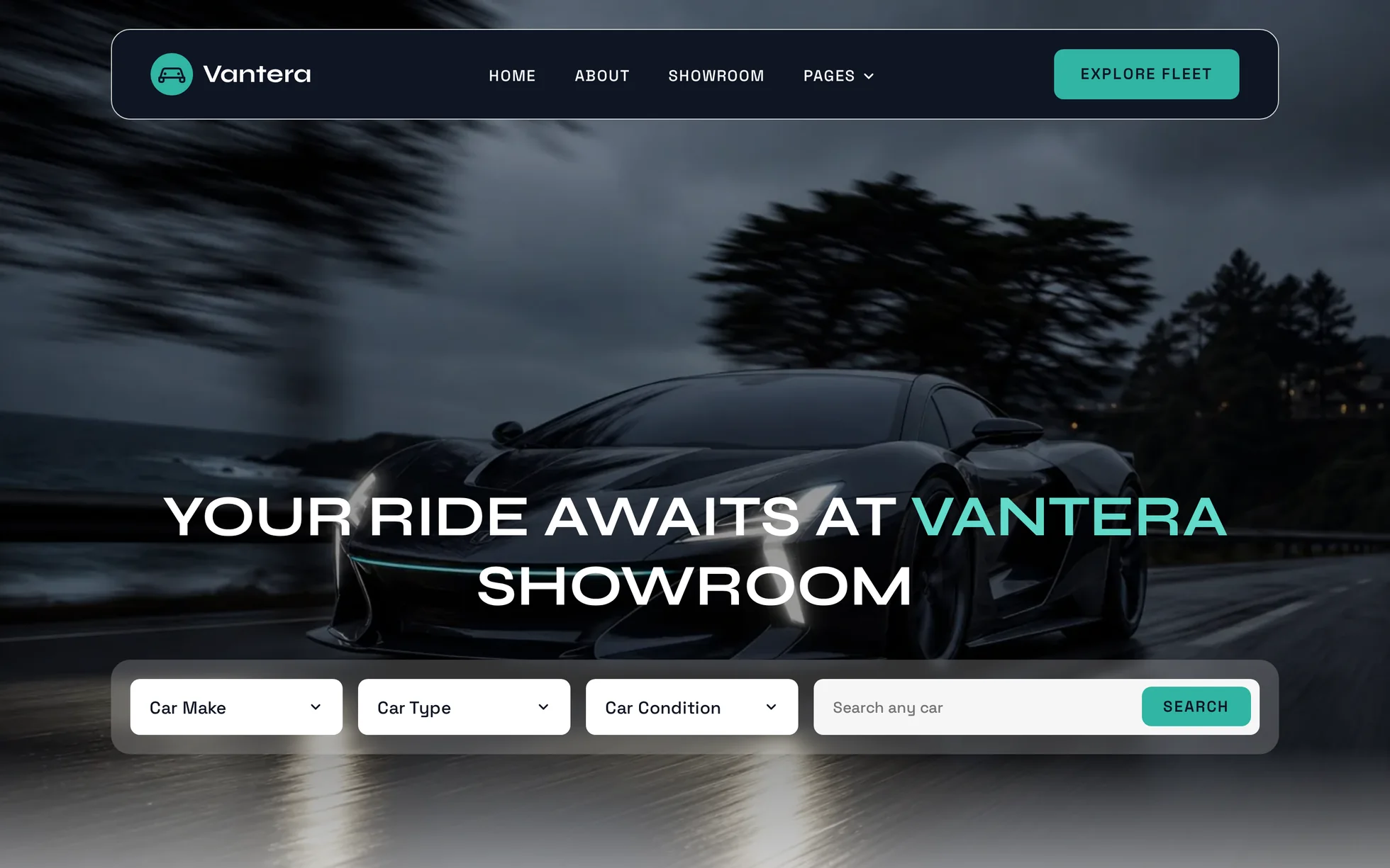
A one-page marketing site for a sports and luxury car showroom: a full-image hero with a search bar, a figures panel, six car cards, four buying steps, a review carousel, two showrooms, four articles, two calls to action, a five-column footer. One page, one HTML file.
What makes this site is its hero: a full-width photograph over which three layers are stacked in a single CSS property — a flat 40% darkening so white holds up, a fade to white over the last quarter, and the photo. It's that fade that lets the dark figures panel overlap the image by 140 px with no clipping and no mask.
The design comes from a Webflow dealership template of which only the structure has been kept. Everything else has been rewritten: jQuery, the IX2 animation engine and its 126 events, the 94 kB of minified CSS, the home-made slider, the editor's badge, and the style="opacity:0" set inline on every animated block — which a strict security policy blocks, leaving a blank page.
The site has been renamed, and not only in the title: the five real car makes it showed — logos included — have become five invented ones, and so have the four social networks in the footer. Twenty photographs were produced for this template.
What you change first
The colours — nine lines
Right at the top of assets/css/style.css:
--accent:        #31b5a3;  /* fills: buttons, badges, stars */
--accent-deep:   #1f7a6e;  /* writing on light, and hovers */
--accent-bright: #62daca;  /* writing on a photo, and on the ink */
--ink:           #0e1523;  /* dark panels, footer, text */
--cloud:         #f6f6f6;  /* the grey sections */
One thing to know before touching it: the accent exists in three shades and they aren't interchangeable. The solid teal passes at 7.2:1 on the midnight blue and disappears on white (2.5:1); the dark version does the opposite, at 4.8:1 on the light grey; the lightened version holds at 10.8:1 on the ink and at 7.5:1 on a darkened photo. Changing one means changing all three.
The name
Search for “Vantera” in index.html: the title, the description, the logo, the hero, the footer, the email address.
No CSS class carries the brand name, so a find-and-replace can't break anything. The logo is a 667-byte SVG pictogram; the word beside it is text, in the template's own font.
The cars
A card is one <article class="car">. Duplicate it or delete it, the grid recomposes itself — the same goes for a review and for an article. The photos' display ratios are fixed in CSS by
aspect-ratio: 16/9 for a car, 25/18 for a showroom, 3/2 for an article. An image with another ratio is cropped, not distorted.
The sizes
The type scale is declared once at the top, then redeclared at each of the three breakpoints. So a heading never gets its own media query: you change --h2-size and every section heading follows. If you find yourself writing a @media
elsewhere in the stylesheet, you're probably missing a token.
The thirteen effects, and how they're built
The settings aren't eyeballed: they're read out of the store
ixData of Webflow's animation engine, then deduplicated. The template declares 126 events there — one per collection instance — for 13 distinct effects.
| Effect | Original | Here |
|---|---|---|
| Fade in (32 blocks) | opacity 0 → 1, 1 s, outQuart, 0% threshold | [data-reveal="fade"], same 1 s, threshold moved to 15% |
| Rise of 50 px, 100 ms delay | y 50 → 0 + opacity, 0.5 s, outExpo | data-reveal-delay="100" |
| … 200 ms delay (11 blocks) | same, 200 ms delay | data-reveal-delay="200" |
| … 300 ms delay (10 blocks) | same, 300 ms delay | data-reveal-delay="300" |
| … 400 ms delay (9 blocks) | same, 400 ms delay | data-reveal-delay="400" |
| … 500 ms delay (7 blocks) | same, 500 ms delay | data-reveal-delay="500" |
| … 600 ms delay (14 blocks) | same, 600 ms delay | data-reveal-delay="600" |
| Zoom on hover (15 photos) | scale 1.05 in 300 ms | :hover on the frame, same 300 ms, frame set to overflow: hidden |
| “Pages” menu — opening | display, y 10 → 0, opacity, 300 ms, chevron −180° | aria-expanded + a class, same 300 ms, same half-turn |
| “Pages” menu — closing | opacity 1 → 0, y 0 → 10, 300 ms | the same transition in reverse, plus two hover delays |
| Hero filter — opening | same, plus a height 0 → auto | <details> native, class set on the next frame |
| Hero filter — closing | 300 ms | same, in reverse |
| Review carousel | home-made slider, 500 ms, endless loop | track scroll-snap, two arrows, position announced |
What you should know
- No external requests. Self-hosted fonts, local images, zero CDN. Checked by listing the requests on load, not assumed.
-
Without JavaScript, nothing is hidden. The hidden state of the scroll reveal is written under
html.js, a class set before the first paint. Checked by removing the<script>: 25 headings out of 25, 68 paragraphs out of 68, all six cars, all six reviews, and the menu staying open. -
The filters and the menu are native. The hero's three filters are
<details>elements: they open by click and by keyboard, script or no script. The “Pages” panel opens on:focus-within, so from the keyboard alone. The script only adds the 300 ms animation — and it has to add it, because a closed<details>is removed from rendering and a@keyframeswould never replay after the first opening. -
The carousel slides on its own. The track is a scroll container with
scroll-snap: mouse, finger and arrow keys all work without a line of JavaScript. The two buttons, their disabled state at either end and the position announced throughrole="status"are the layer on top. -
Zero inline styles, zero inline scripts. The template honours the site's strict security policy, checked by serving the folder with the real header — read from the project's
/_headersfile, not copied out. - The trigger sits 15% up from the bottom of the screen, measured against the screen and not against the element as in the original. A threshold expressed as a fraction of the element never fires for a block taller than the viewport — and here a block visibly enters instead of having finished before it was seen.
- Contrast corrected. The original writes in white on its green accent: 2.6:1, where 16 px text needs 4.5. Here a solid button's label is in midnight blue, at 7.2:1 on the same fill.
- Responsive checked at 390, 1440 and 2560 px, on load and throughout the scroll, with no horizontal overflow.
What isn't perfect
Better said here than left for you to find out.
- The carousel doesn't loop. The original loops for ever; here the track stops at the sixth card and the arrows are disabled. An endless loop on a native scroll container means duplicating the cards and resetting the scroll on every lap: a lot of code for six items, and a track that no longer traverses cleanly from the keyboard.
- The filters don't filter. They open, remember the value chosen and write it on the trigger, but there's only one page: every option points at the fleet's anchor. A real filter needs a database. The same goes for the hero's search and the footer's sign-up.
- The “How it works” section is taller than the original's by 96 to 109 px depending on the width. That's deliberate: below 992 px the original hides its “Get started” button and its introductory paragraph. They stay here — this is the section that explains how to buy, and mobile is most of the traffic.
-
The mobile hero only shows part of the car.
The block is 479 × 965, a ratio of 0.50:
background-size: coversizes the image to the box's height and crops the sides, sobackground-positioncan do nothing about it and the file's own crop decides. The original has exactly the same limitation — all you see there is the roof. - The six reviews are hard-coded in the HTML. Beyond twenty or so, you'd want to load them rather than write them.
-
The images are royalty-free: the twenty photographs and the twenty-two pictograms were produced for this template and can be redistributed without restriction and without attribution. Only the fonts keep their own licence — Syne and Space Grotesk are under the SIL Open Font Licence, checked in the
nametable of the files shipped.
It’s waiting for you in the library.
Vantera comes with the subscription, alongside the rest of the library and the full course.
Immediate access · No commitment · Cancel in one click