What it is
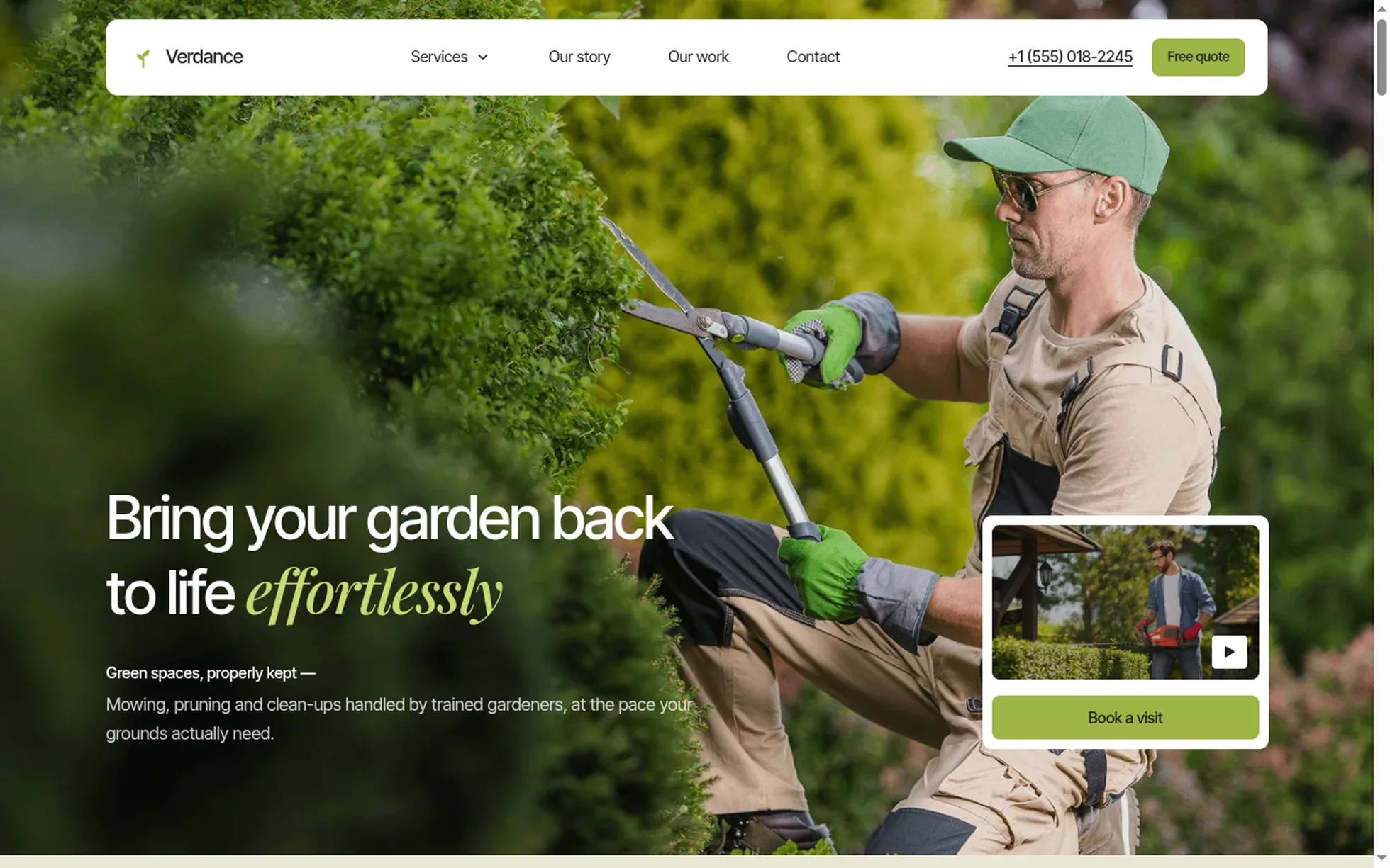
A landscaping company's site, complete: a photo hero, selling points, an intro, services, figures, steps, a review carousel, a gallery, an FAQ, a journal, a call to action, a footer. One page, one HTML file.
The design follows that of a commercial template, of which only the photos and the videos have been kept. All the code has been rewritten: the original came to 175 kB of minified CSS, jQuery, five bundles totalling 2.4 MB, a proprietary animation engine, seven Lottie animations and an e-commerce basket that calls a non-existent API as soon as you leave the tool. Unreadable, and therefore useless for learning from.
That's the whole point: this template isn't here to be admired, it's here to be read, broken and rebuilt.
What you change first
The colours — eight lines
Right at the top of assets/css/style.css:
--color-accent:        #9cb544;  /* buttons, highlighted words, icons */
--color-accent-light:  #c5da72;  /* the same olive, lightened for text over photos */
--color-deep:          #2c3a2a;  /* dark panels, footer, CTA */
--color-cream:         #f2eee3;  /* page background */
--color-terracotta:    #c96f4a;  /* review stars */
One thing to grasp before touching anything else: there are three olives, not one. The solid accent passes AA contrast on the cream and on the deep green (5.2:1), but it vanishes into the foliage of a photo. That's why the italic words in the hero and in the green panel use the lightened version (7.8:1). If you change the accent, change all three.
The name
Search for “Verdance” in index.html. No CSS class carries the brand name: a find-and-replace can't break anything.
The sizes
The type scale is declared once, then redeclared at every breakpoint. So a heading never gets its own media query: you change --h2-size and the whole page follows.
The sixteen effects, and how they're built
All taken from the data of the original's animation engine — 117 events on this page, 55 timelines, pulled out of the store then measured in the browser, not by eye. After deduplication 37 distinct animations remain, grouped here into sixteen effects.
| Effect | Where | How |
|---|---|---|
| Scroll reveal | 48 blocks, three directions | IntersectionObserver, firing 15% up from the bottom of the screen |
| Hero card that shrinks | home | the JS writes a progress variable, the CSS applies the scale |
| Curtain over the photo | intro | height 100% → 0, then the opacity follows |
| Staircase of steps | 4 columns | each column drops 86 px further, all at 172 px/s |
| Service hover | 3 cards | the photo grows, the description unrolls from 0fr → 1fr |
| Journal hover | 3 cards | the photo grows and blurs, the badge appears |
| Accordions | 5 questions | <details> native, animated height |
| Buttons | everywhere | two labels stacked in a clipping box, the second replaces the first |
| Carousel | reviews | native scroll-snap: dragging, swiping and the keyboard all work without JS |
| Odometer counter | reviews | a strip of digits rising one line per card |
| Social icons | footer | a 29 px roll in a 33 px box |
| Dropdown | “Services” | hover by keyboard and mouse, tap on a touchscreen |
What you should know
- No external requests. 37 requests on load, all of them local. The original loaded jQuery and five bundles from two domains.
-
Scroll reveals can't hide the content.
The hidden state only exists once the JavaScript has run. Checked by removing the
<script>: 20 headings out of 20 stay visible. The original, meanwhile, setstyle="opacity:0"on every animated block. -
Zero inline styles, zero inline scripts. The template honours the site's strict security policy — the very one that
style="opacity:0"breaks. - The trigger sits 15% up from the bottom of the screen, not at the first pixel as in the original: a block visibly enters instead of having finished before it was seen.
- Accessibility: skip link, menu states announced, native FAQ, carousel position announced, visible focus, decorations hidden from screen readers, animations switched off if the system asks.
- Responsive checked at 390, 1440 and 2560 px, on load and after scrolling all the way down, with no horizontal overflow.
What isn't perfect
Better said here than left for you to find out.
- The service headings sit straight on the photo, with no scrim, as in the original. On the lightest card the contrast is tight. I had added a gradient, removed to stay 1:1.
- The page is 6% taller than the reference. French text is longer than English. Nothing overlaps.
- The staircase of steps only plays above 991 px. Below that the columns stack, and there's no staircase left to form.
- The e-commerce basket has been removed. Outside its original tool it called a non-existent API. It's replaced by the phone number and the “Free quote” button.
- The photos and the videos come from the original template. The code is yours; for the visuals, check the licence or replace them. The fonts themselves are free to redistribute.
It’s waiting for you in the library.
Verdance comes with the subscription, alongside the rest of the library and the full course.
Immediate access · No commitment · Cancel in one click