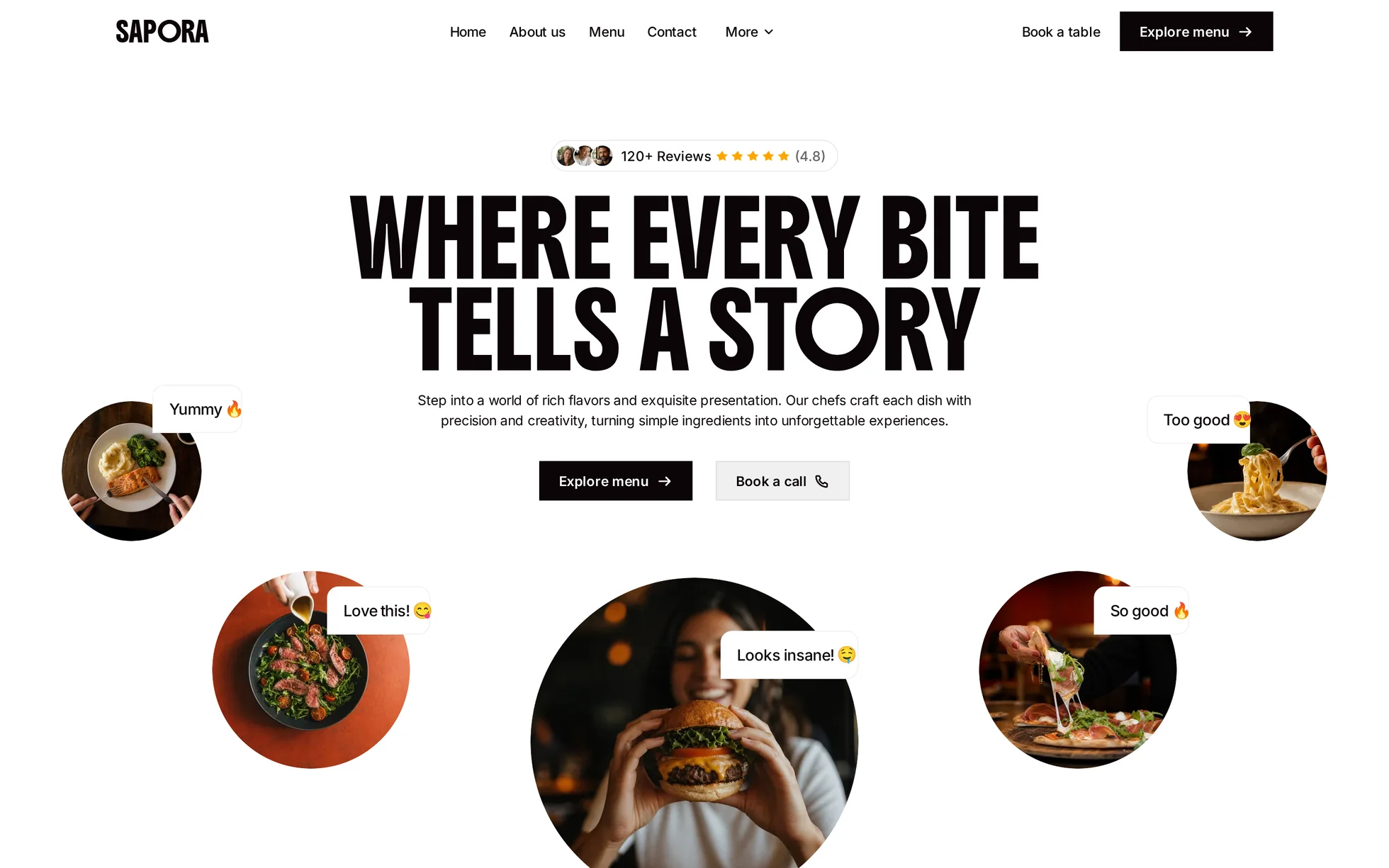
What it is
A complete restaurant site, on a single page: hero, intro, a filterable menu of eight dishes, cooking method, atmosphere, customer reviews in a marquee, two addresses, a social marquee and a footer. One HTML file, one stylesheet.
The design follows that of a commercial template, of which only the photos have been kept. All the code has been rewritten: the original came to 175 kB of minified CSS, jQuery, three bundles from the editor, a proprietary animation engine and an e-commerce basket that calls a non-existent API as soon as you leave the tool. Unreadable, and therefore useless for learning from.
That's the whole point: this template isn't here to be admired, it's here to be read, broken and rebuilt.
What you change first
The colours — seven lines
Right at the top of assets/css/style.css:
--noir:         #0c0407;  /* text, solid buttons, footer */
--fond:         #f0f0f0;  /* soft buttons, tabs */
--fond-doux:    #f7f7f7;  /* review and method cards */
--accent:       #c0421f;  /* hovers, links, focus */
--accent-fonce: #93300f;  /* the same, one notch darker */
--accent-clair: #f0906b;  /* the same, lightened for text over photos */
--etoile:       #ffa600;  /* the ratings */
One thing to grasp before touching anything else: there are three terracottas, not one. The solid accent passes AA contrast on white (5.20:1) and on the grey background (4.56:1), but it would vanish over a dark photo — that's what the lightened version is for (8.60:1 on black). The dark one is for hovers (7.86:1). If you change the accent, change all three: the template's test bench recomputes the seven ratios for you.
The name
Search for “Sapora” in index.html. No CSS class carries the brand name: a find-and-replace can't break anything. The logo is simply a word in the template's own font, so it follows by itself.
The menu
Each dish carries its services in an attribute:
<li class="plat" data-cours="signature soir">. Adding a tab means one <input type="radio">, un
<label> and one line in the selector list in part 7 of the stylesheet.
The sizes
The type scale is declared once, then redeclared at every breakpoint. So a heading never gets its own media query: you change --titre-1 and the whole page follows.
The fourteen effects, and how they're built
All taken from the data of the original's animation engine — 161 events and 38 action lists, pulled out of the JavaScript store then measured in the browser, not by eye. The editor creates one event per collection item: after deduplication there remain fourteen distinct effects, eleven of which are reproduced here.
| Effect | Original settings | How |
|---|---|---|
| Scroll reveal | 50 px, 400 ms, 5 px blur, delays from 200 to 700 ms | IntersectionObserver, firing 15% up from the bottom of the screen |
| Button arrow | 500 ms, outQuint | a CSS transition, same duration and same curve |
| Review marquee | two rows, ±100%, 30 s linear | two @keyframes, the track duplicated by the script |
| Social marquee | one row, −100%, 30 s | same mechanism, slowed to 45 s: the row is half as long |
| Social thumbnail hover | photo ×1.1, icon ×0.5 → 1, 500 ms | the same, in CSS transitions |
| Dropdown | opacity + 20 px, icon at −180°, 300 ms | the same, plus two hover delays (80 ms / 280 ms) |
| Footer links | −50%, 300 ms on entry | the label written twice in a clipping box |
| Mobile menu | opens on click | aria-expanded + grid-template-rows: 0fr → 1fr |
| Dish cards | accordion on click | <details> native — opens without JavaScript |
| Menu filter | JavaScript tabs | radio buttons and one :has()rule, zero script |
| Rows without JavaScript | — | scroll-snap: you can still swipe them and tab through them |
What you should know
- No external requests. 41 requests on load, 45 after scrolling all the way down, all of them local. The original loaded jQuery and three bundles from two domains.
-
Scroll reveals can't hide the content.
The hidden state only exists once the JavaScript has run. Checked by removing the
<script>: 25 headings out of 25 stay visible, no block is hidden, all eight dish cards open. The original, meanwhile, setstyle="opacity:0"on every animated block. -
Zero inline styles, zero inline scripts. The reveal order goes through a
data-reveal-rangattribute and attribute selectors, precisely because astyle=""would be blocked by the site's strict security policy. - The trigger sits 15% up from the bottom of the screen, not at the first pixel as in the original: a block visibly enters instead of having finished before it was seen. The threshold is measured against the screen and not against the element — otherwise a block taller than the screen would stay invisible for ever.
- The active menu tab is marked. In the original all six tabs looked the same: you couldn't tell which one you were looking at. Here it inverts to black.
-
Accessibility: skip link, menu states announced, filter result announced through
role="status", row copies markedaria-hiddenandinert, a single visible focus style, animations switched off if the system asks — delays included. - Responsive checked at 390, 1440 and 2560 px, on load and after scrolling all the way down, with no horizontal overflow. The page is 7,220 px tall against 7,305 px for the original, a difference of 1.2%.
What isn't perfect
Better said here than left for you to find out.
-
The e-commerce basket has been removed. Outside its original tool it called a non-existent API. “Add to Cart” has become “Book a table”, an anchor to the addresses and their phone numbers; “View details” has become a native
<details>that unfolds what's in the dish. - The “Dessert” tab has been removed, five instead of six. All eight of the original's dishes are savoury: the tab returned nothing, and a filter that returns nothing is a dead end.
- On a phone the page is 5.6% taller than the reference, for three deliberate choices: the social marquee stays visible where the original hides it, the six reviews stay on two rows instead of three, and the five hero dishes move into the flow as a single swipeable row.
- Three effects aren't reproduced: the scale-up entrance and the long sideways entrance are only used on pages absent from this rebuild; enlarging a dish's photo on hover suggested a link to a product page that doesn't exist here.
- The photos come from the original template. The eight dishes on the menu are, judging by their uniformity and their file names, AI-generated; the other thirty are stock photos. The code is yours; for the visuals, check the licence or replace them. The fonts themselves are free to redistribute.
It’s waiting for you in the library.
Sapora comes with the subscription, alongside the rest of the library and the full course.
Immediate access · No commitment · Cancel in one click